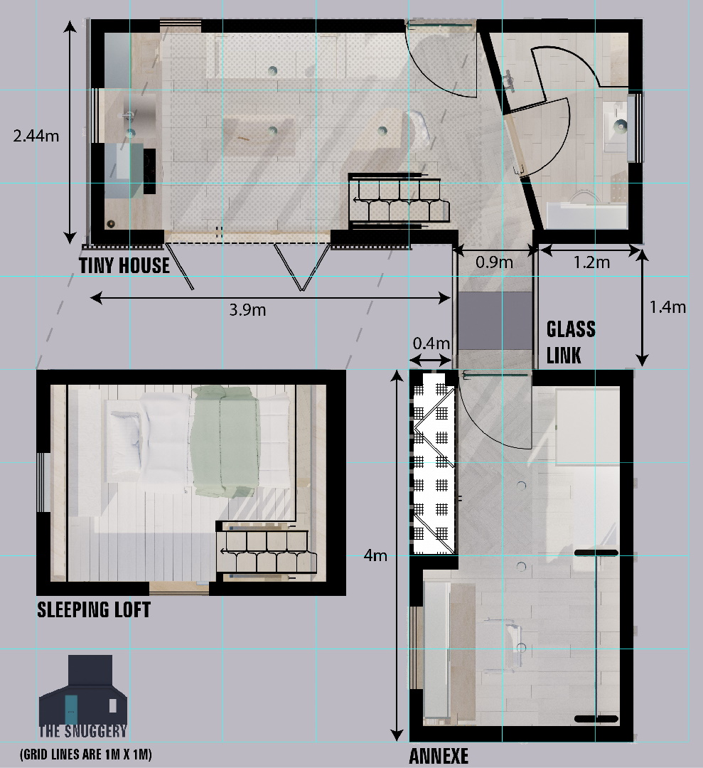
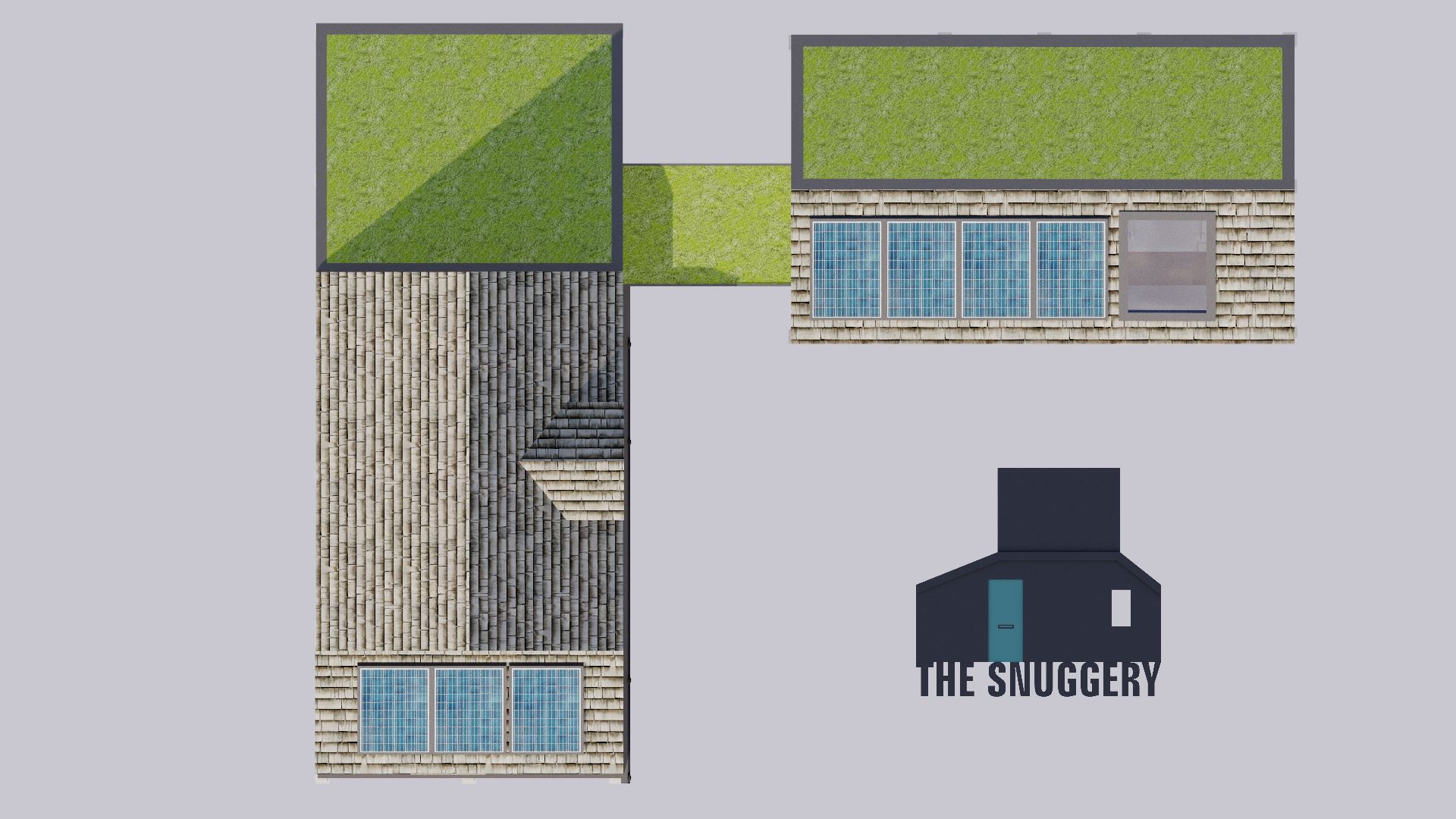
My last blog post featured my first personal tiny house design, and those that saw it will remember that I was not exactly happy with numerous elements of it. Indeed, first impressions of this post will show that a huge amount has changed; not least that the tiny house is now comprised of not one, but two interconnected buildings. It probably seems a strange move given that a huge part of living tiny is to, well, live in a tiny place; usually one which can easily be moved. At the end of the day, most of us still have to work, and it's unfortunate that part of my work involves needing not only a fair amount of room to work in, but also to store tools and supplies. If it wasn't for the modelmaking commissions, I could easily live in a "normal" single tiny house. That said, the whole lot could be moved in three sections; the glass link presenting the only slight issue with regards to making it easily removable but still watertight. Of course, if moving seems a likelihood, the glass link could be removed entirely from the design, and a door put on the tiny house instead. The way I look at it is that the set-up is no different from someone that works from home; the annexe is exactly like a study (or a garden office if you plan to remove the link section).
If you haven't seen it (or need a reminder), you can read the previous blog entry here!
The danger with adding the annexe is exactly what we discussed last time in that the more space you allow yourself, the more space you end up wanting (basically "the grass is always greener..." etc). To stop myself from wandering from the original brief, I limited the tiny house to be exactly the same length and width as the first design. The annexe must also be significantly shorter both in terms of length and height, and also be no wider than the tiny house. My philosophy is to reduce dimensions wherever possible; so the studio is only as long as is needed to comfortably carry out my work and store materials I need. It could be argued that the roof pitch could be reduced, but at around 30 degrees it is the optimum angle for siting solar panels here in southern UK (also, boards could be placed on the rafters if more storage is needed).
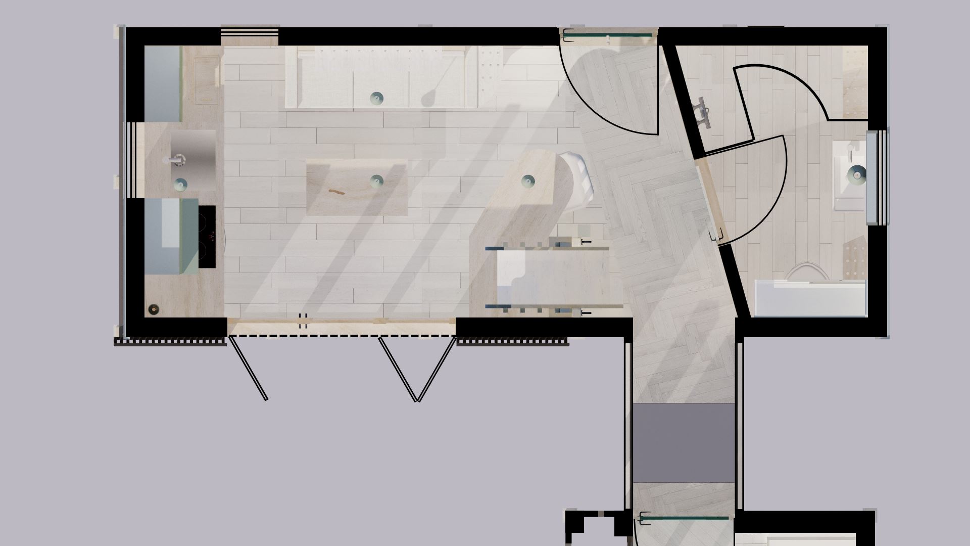
The total square footage of the entirety of the plan is still well under the 400 sq ft tiny house limit; sitting at a comfortable 271 sq ft. Technically, I shouldn't be taking into account any areas with less than 1.5m headroom, but I've always included them in all previous designs for ease of calculation. The focus on total area may seem somewhat petty, but it's a huge topic of debate, particularly with new builds. Even the RIBA (Royal Institute of British Architects) has pressured the government to make sure any new build homes meet minimum sizes; in particular bedrooms when measured according to the number of occupants. I can see how this is a positive step for almost everyone (stopping greedy landlords from attempting to rent out tiny rooms to poorer people etc.), however, it doesn't help those that wish to live tiny!
Technical requirements*(only selected those relevant - most of which this design fails to meet!)
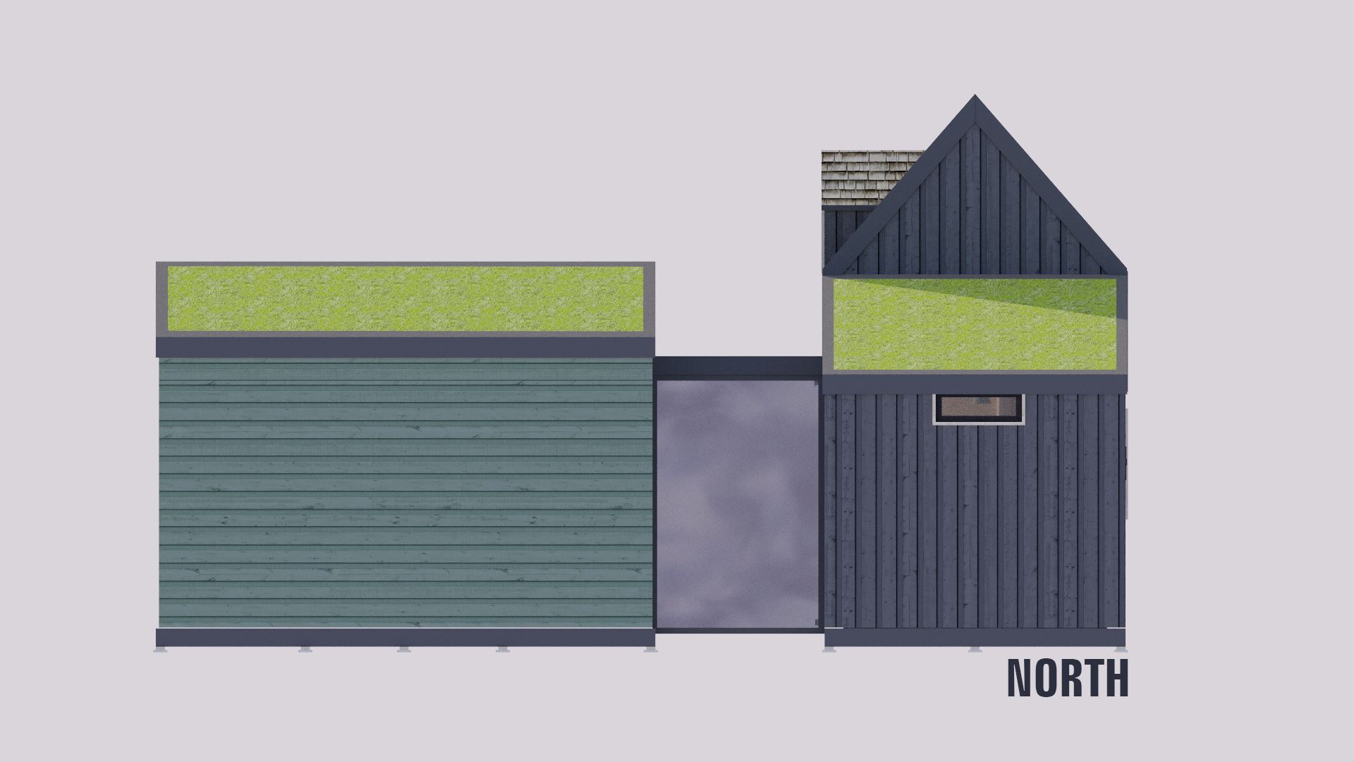
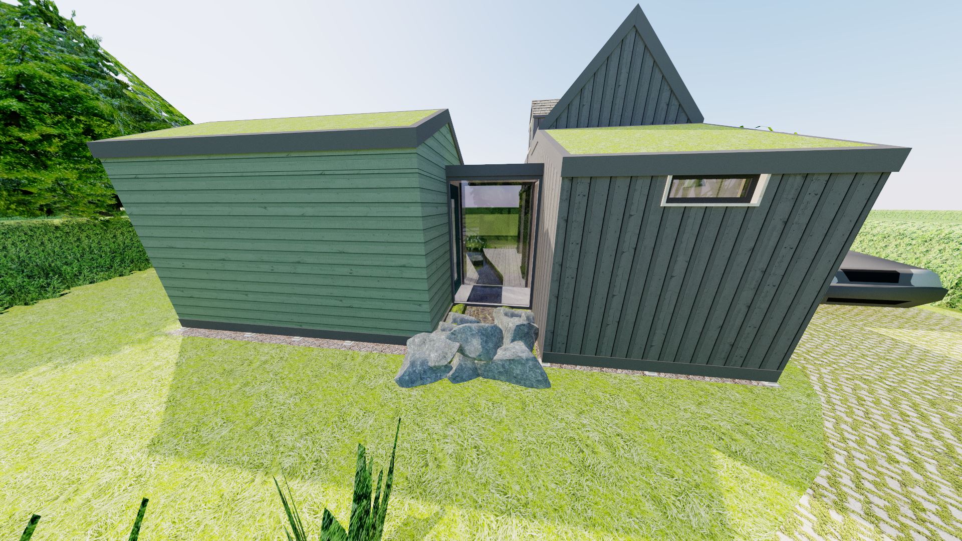
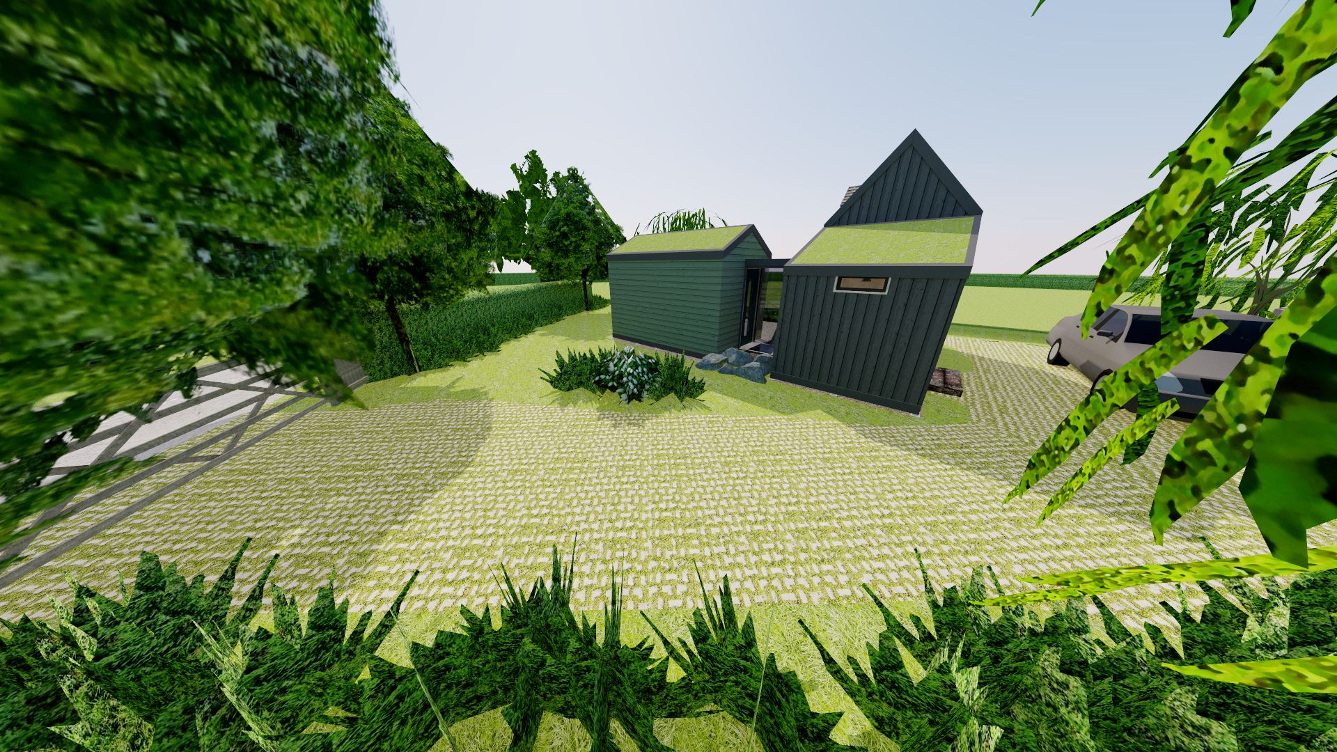
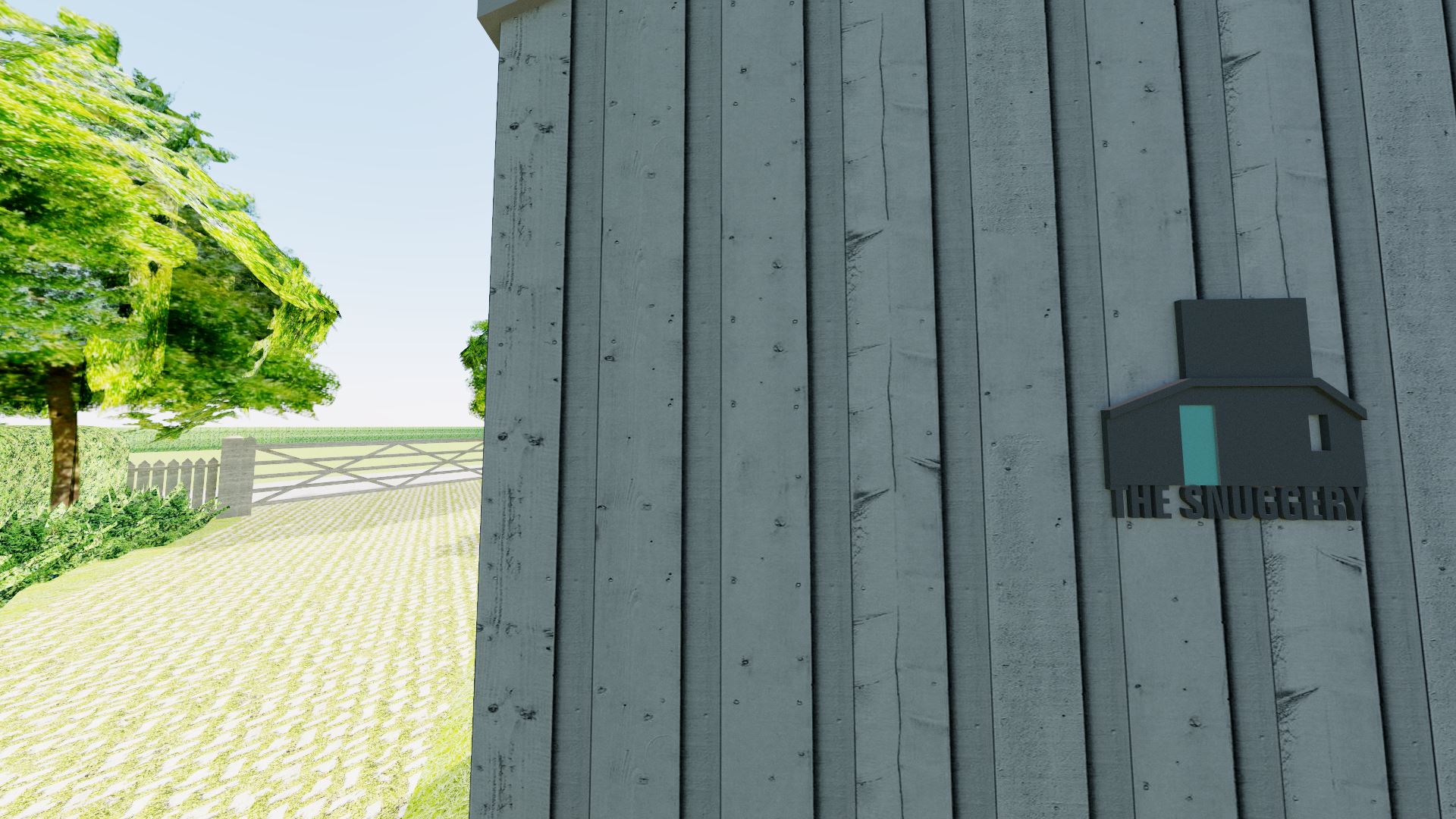
The exterior is vastly different from the somewhat streamlined nature of the previous design. The result is a tiny house with a more generous headroom in the loft. It also exudes a more traditional look that would definitely not be out of place in the New Forest. The board and batten has been kept, but with wider boards and a painted finish to try and replicate other such dwellings nearby. Black seems to be the colour of choice, and the sage green of the annexe will hopefully help it blend in better to the natural environment; this also helps differentiate the two parts of the building, and is something the New Forest Design Guide recommends.
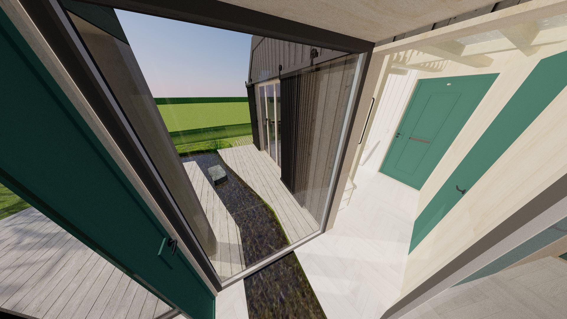
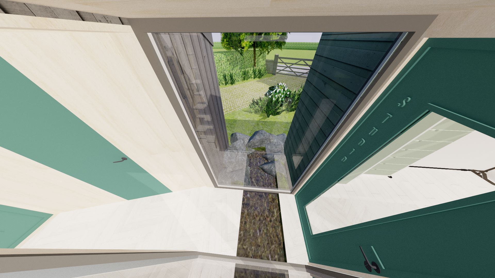
I decided to do a bit of landscaping around the back of the property to show what it may look like when it's fully bedded in to the environment around. Decking higher than 300mm is typically forbidden in the New Forest, so I've kept it as low as possible. A shallow pond splits the decking into two parts; running from the front of the property, underneath the glass link (which has a glass floor), and ending up in a slightly larger pond that is surrounded by a moss garden. It's actually quite a formal look, although the big stepping stone adds a little fun to the design.
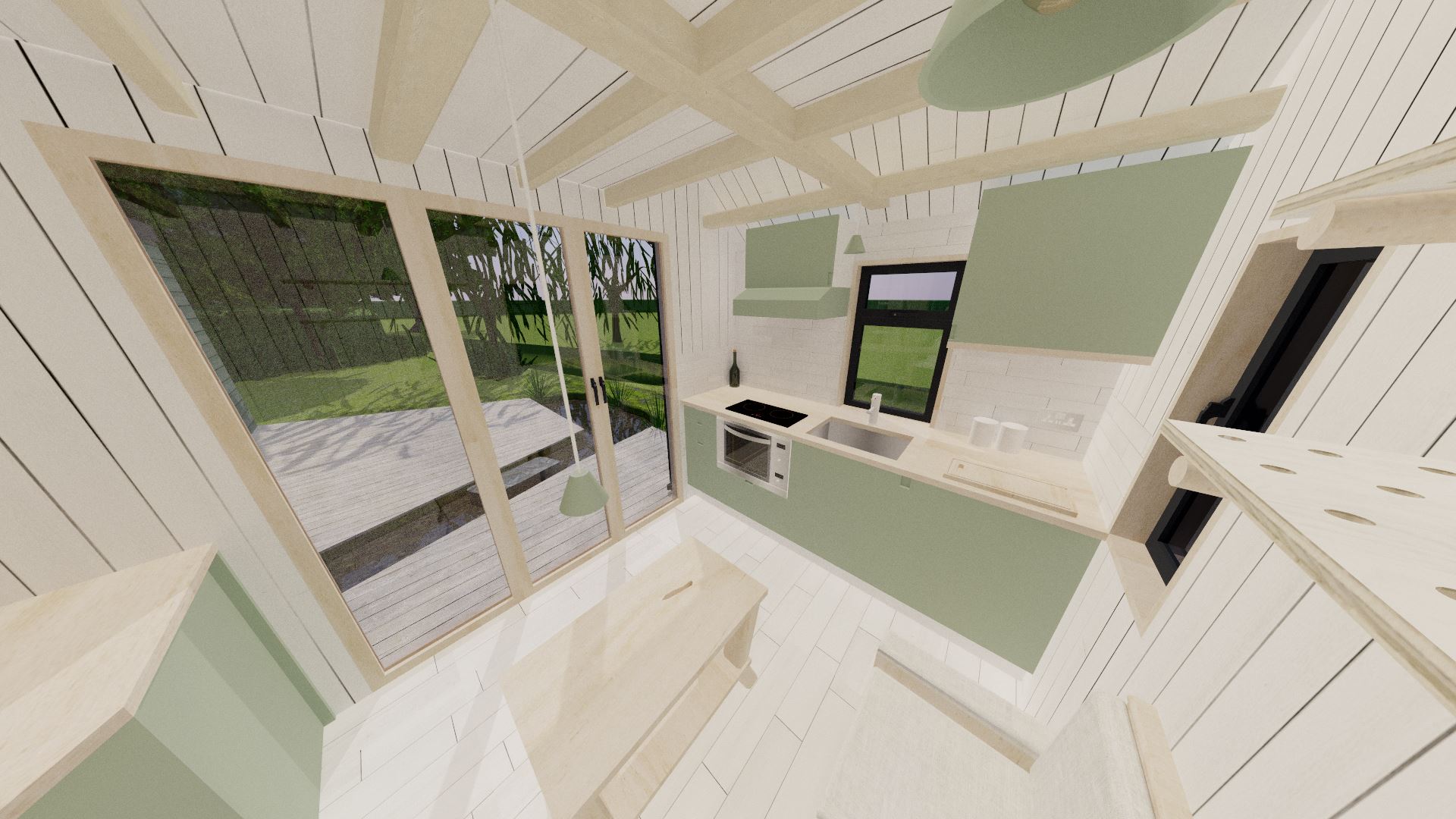
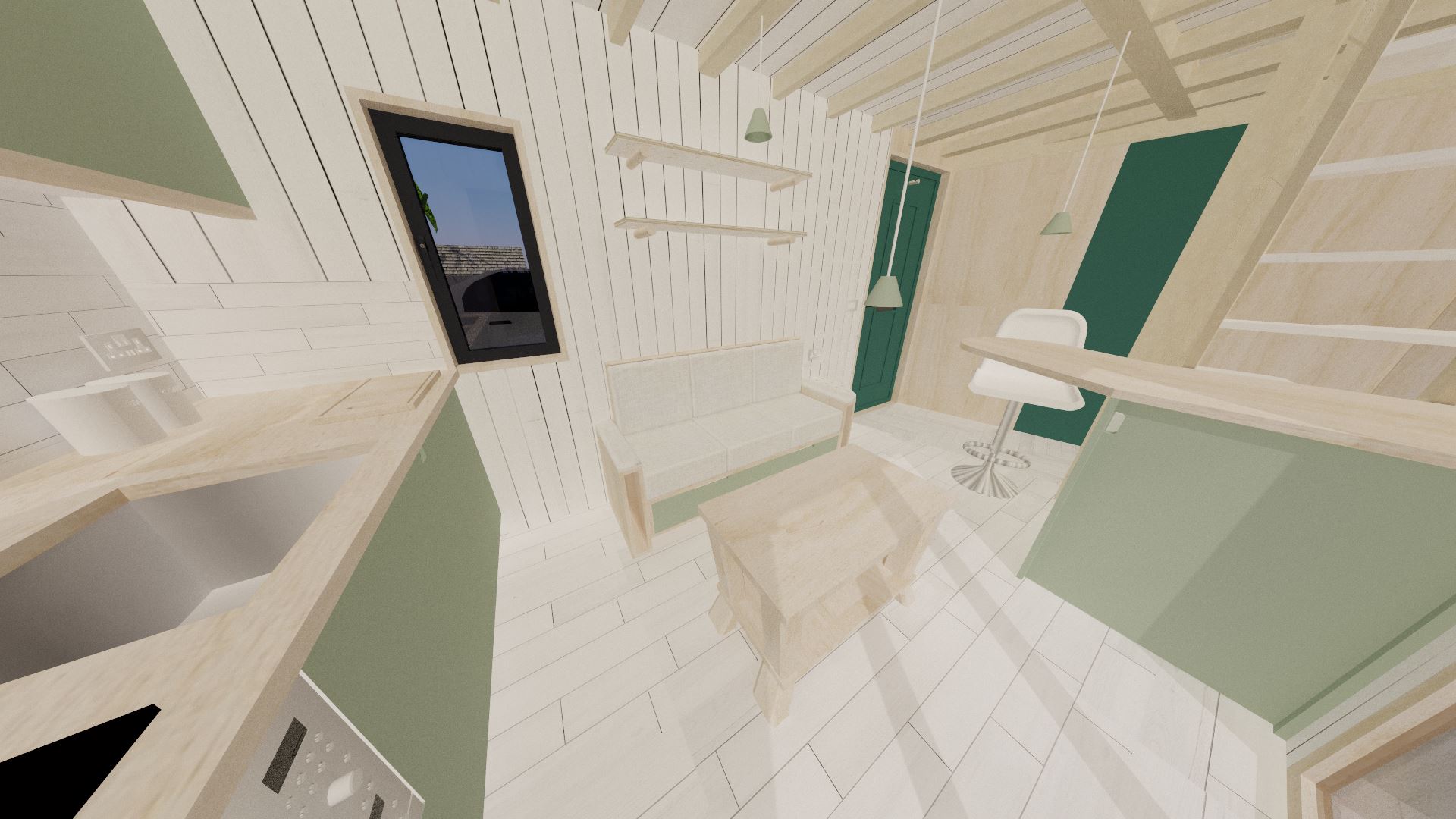
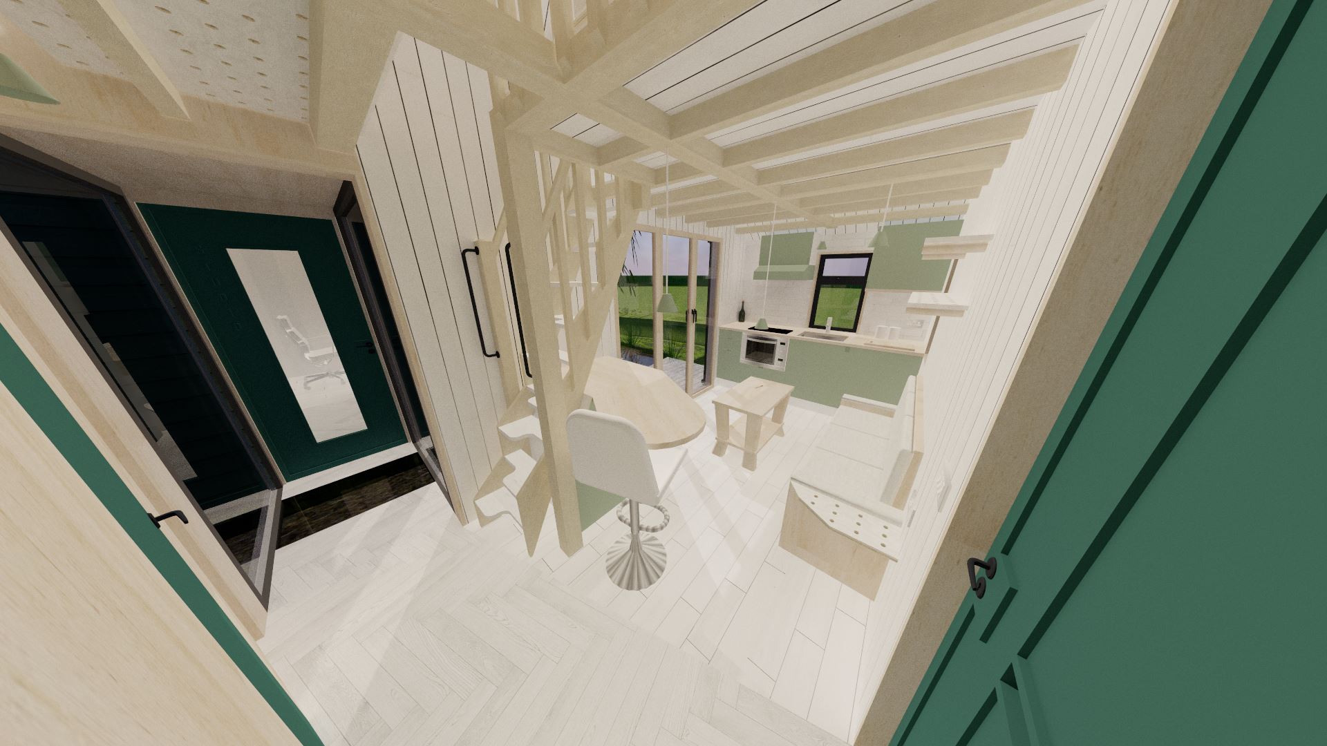
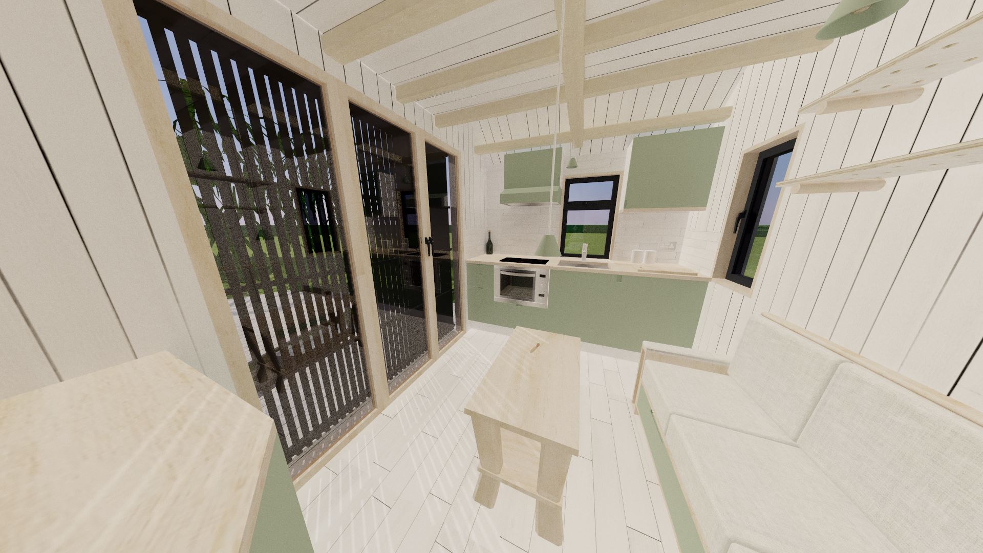
The obvious change with the inside of the tiny house is the removal of the raised storage platform, and the addition of a proper front door. Whilst the platform would've added useful storage, due to the new position of the bi-fold doors, there was no room for a step down on that side (and I could not raise the bi-fold doors due to the limited ceiling height and outside decking). This loss of seasonal storage is not exactly a huge problem; and there are alternative possibilities (such as in the roof space of the annexe) if such space is needed later on.
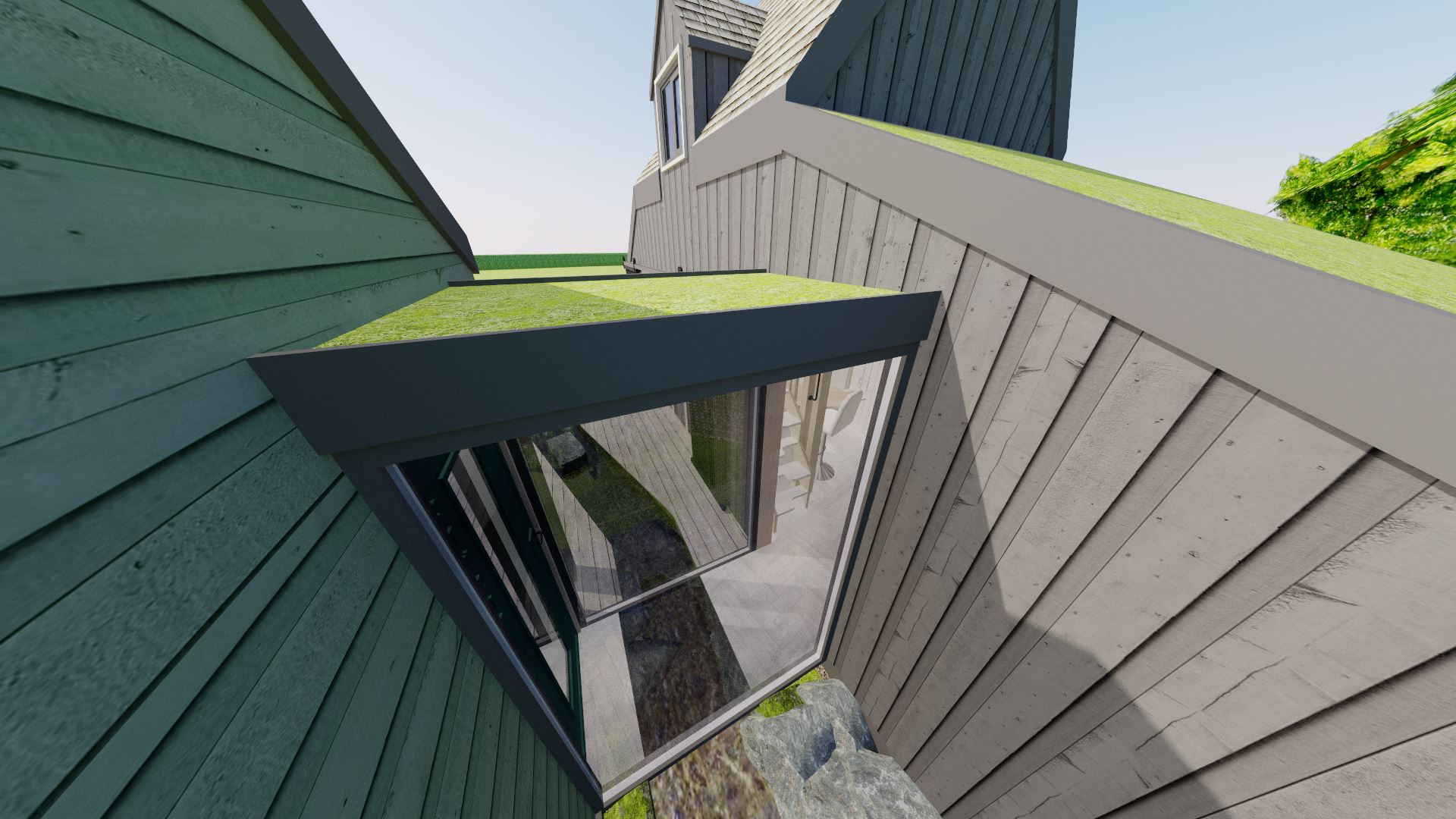
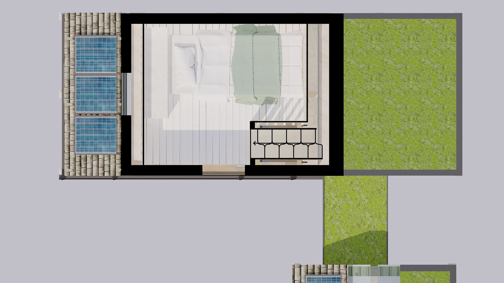
The new front door was able to be added thanks to the removal and subsequent relocation of the original desk into the annexe. As a result, I was able to add a through-corridor area straight through the glass link and into the annexe. You may remember from the last blog post that I typically frown upon corridors because they are essentially wasted space. I had originally planned to have the entry door as part of the glass link, however this would not be as secure as a front door, and would also mean the door would block the entire glass link. In the end, the small amount of space lost by having the corridor was negligible compared to the plus points of the convenient entrance. As a bonus, it also creates a classic way to make spaces seem larger; by being able to have a visible sight line right through to the far end of the annexe.
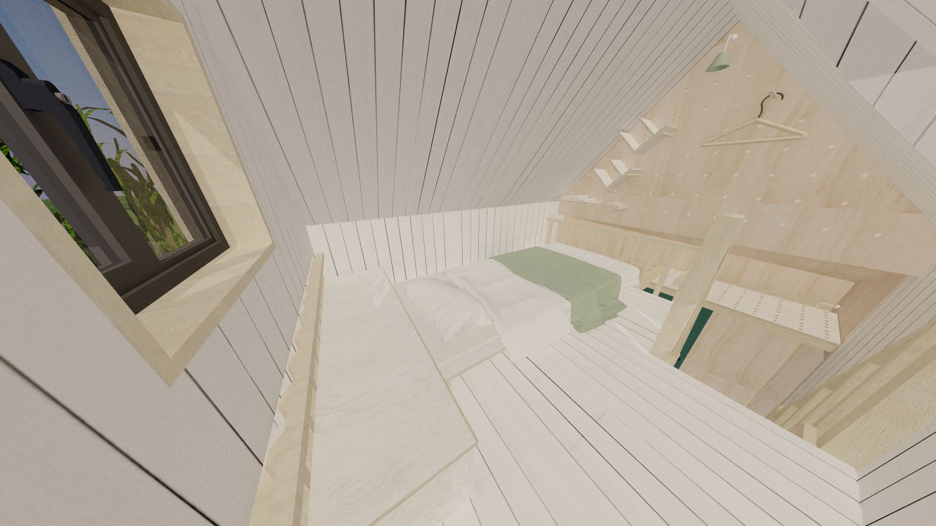
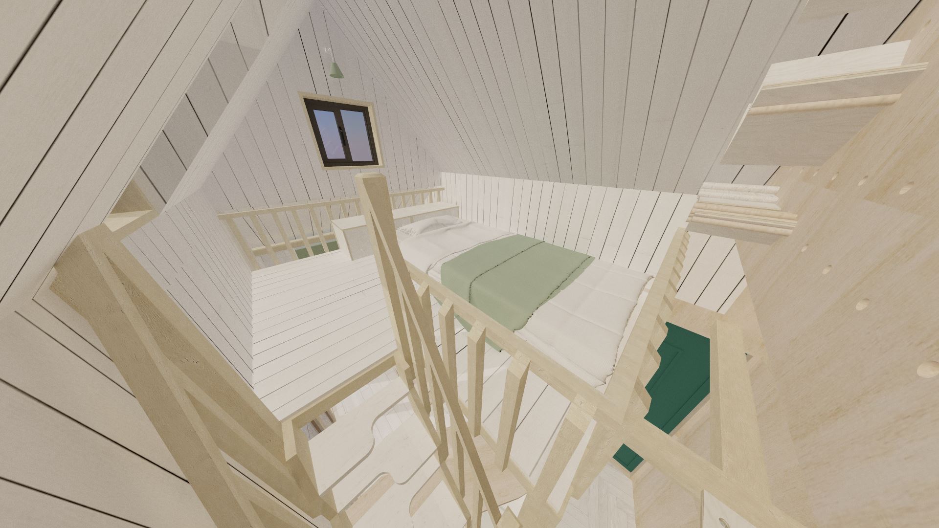
The main change with the tiny house is the roof line, which is now a standard pitched roof, with a cat-slide roof to the north (where the wetroom is) and south (where the kitchen is). The house also now takes the form of a 1.5 storey property, which as you'd expect means the second storey has half-height (or less) walls; the roof pitched roof giving the extra height inside. This happens to be something once very common in the New Forest; particularly with thatched properties where the upper storey was almost entirely in the roof space. This means the sleeping loft has more headroom overall, even if it's not enough to stand up in, it will be enough to sit-up unlike the last design. The small dormer window located at the top of the stairs helps give a little bit more headroom on the ascent, although care will still need to be taken.
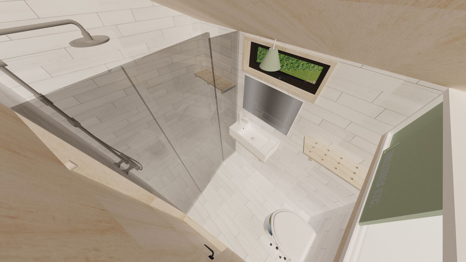
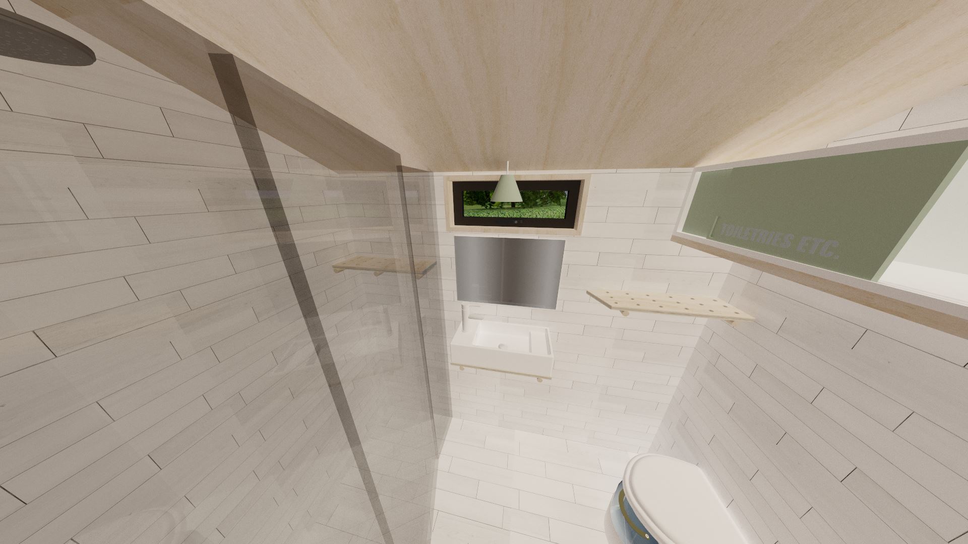
The wetroom is still very small, but has had minor modifications made. The previous designed suffered from the problem that the shower was not separately enclosed; so everything in the wetroom would get wet. Even if that's kind of the point with wetrooms, it would certainly help to keep as much of it dry as possible; not only to reduce the amount of cleaning needed, but also to make it easier to dry off! As such, the new wetroom has a glass divider for the shower; the door of which can be opened either inward or outward for ease of access. I've also added a new shelf in the shower to provide space for shampoos and suchlike. The angled wall that forms the divider between the wetroom and the rest of the house allows more room for the shower, making for a more comfortable experience. Apart from that, the wetroom is pretty much the same as the previous design.
The studio is only 4m long (compared to the tiny house's 5.4m length). This may initially seem pretty long for a home-working space, but you'd be amazed just how much space is needed not only for my desk, but also for the modelmaking bench, and the tons of storage room needed for materials, tools, and dioramas that I build! Currently all of this (as well as a bed on stilts) barely fits in my bedroom which is only half a metre smaller in footprint. To say there is no room to swing a cat is an understatement; I can barely walk in/out of the room with all my work-related furniture and lighting equipment. In actual fact, I can't reach my clothes closet with everything set-up! That should give you an idea of why a dedicated space is so important.
The design guide produced by the New Forest National Park Authority (NFNPA) suggests that in order to offset large areas of glazing, you can add shutters, hide the glazing from view of the road with outbuildings, or recess them. For the annexe I chose to recess the glazing by 400mm. Whilst it may seem like I waste a large portion of that corner, the resultant overhang actually serves as a good way to reduce the harshness of light streaming through the glass in the middle of the day. As part of my modelmaking involves the need to control the light for photographic reasons, any harsh light will need to be minimised; even if natural light is best for photography. For times when the sun is too low to be obscured by the overhang, I would fit white translucent blinds to the bi-fold doors to spread the light in a diffuse manner.
Clearly version two of "The Snuggery" is a more ergonomically friendly design; not least because of the extra headroom. It's also a lot bigger and as a result harder to relocate if the need arises in the future, but I feel the balance is still there with regards to need vs minimising impact. Yes, it's probably about 40% bigger, but it also finally fulfills all my needs, and gives me a flexible and dedicated working space; something I've never had!
I've heard that people have built separate buildings alongside their tiny house for work and hobby use, but I've never actually seen such an example, and certainly not one that features a glass link. In this case, following the Design Guide set out by the National Park Authority has resulted in a really interesting solution. I just hope that tiny houses are subjected to fewer regulations than "normal" houses in the future so that dwellings like these can be built for those in a similar situation to me.
'Till next time,Jam (Jamie Warne)