
(Click/tap the X above to close this menu)
Design Brief & History Floorplan Exterior Kitchen & Lounge Dining Room & Office Nook Utility & Wetroom Bedroom & Mezzanine Bonus Gallery Final ThoughtsTurning an extremely remote Scottish Highland ex-school building into a 1 bedroom property.
Approx 80m² (861ft²)
Finding inspiration for these designs can be difficult, but the process is always enjoyable. This particular idea spurred from watching an episode of "Restoration Home"; where Caroline Quentin followed two ladies as they converted an old Scottish primary school (Pitkennedy School) into an unusual home. Whilst the end result was not entirely the direction I would've taken, it sowed a seed in my head.
Having watched more episodes, and in particular another series (this time "Restoration Man", with George Clarke), I was determined to find something suitable in Scotland that I could virtually convert. First, I searched Geograph.org.uk for relevant keywords. Happily, I eventually found this old school in Altnaharra; where I could then use Streetview to look at the building from multiple angles, and work out rough dimensions. I don't always find inspiration on Geograph, but either way I'll happily spend many hours browsing Streetview; looking for suitable buildings manually across a wide area! And yes, I really do enjoy it; and in this case with the Scottish Highlands, you know you'll have amazing scenery for the journey...
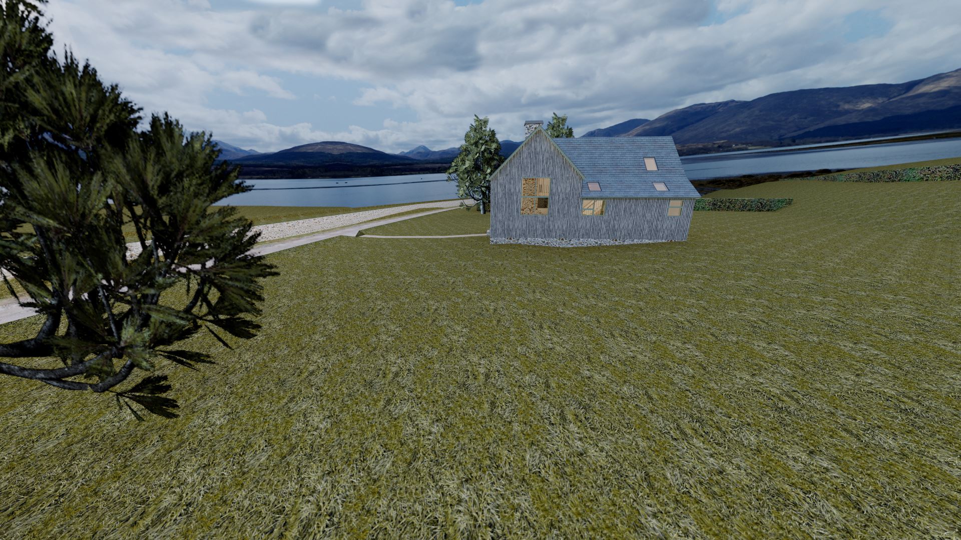
The building is located in Altnaharra, a hamlet in Sutherland, in the Highlands of Scotland. The name is derived from the stream that runs through the settlement ("Stream at the boundary wall"), and the weather here, being so far north, is often at the extreme end in temperature. Indeed, it holds the record for the UK's lowest ever recorded temperature (-27.2 degrees C). Brrr! Chilliness aside, it's also incredibly remote and features some breathtaking scenery. Despite its tiny size, the hamlet features the well known, and rather large Altnaharra Hotel; popular with fishermen and hikers alike.
Information about the building itself proved very hard to find, especially relying solely on records available online. The only page that gives any information, albeit vaguely, is the Highland Historic Environment Record. This tells us it was built between 1878 to 1906; a remarkable survivor. The building was the original school, as well as the post office; although it now lies unoccupied. Being a tiny hamlet, even the modern replacement school two doors down sees only a handful of kids. In fact, it regularly features less than 6 kids between the two parts of the school; half nursery, half primary school!
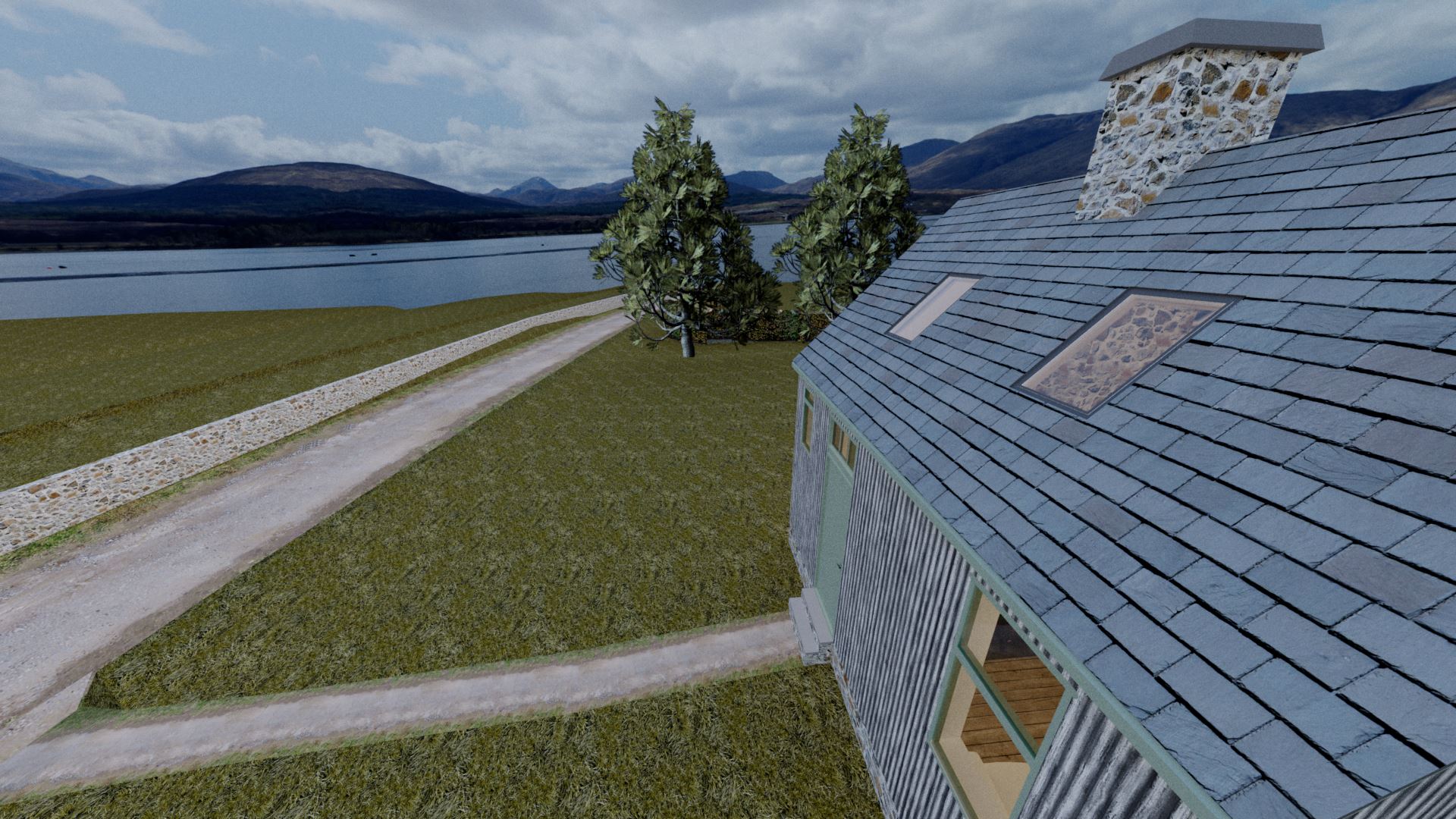
The Old School & Post Office, Altnaharra
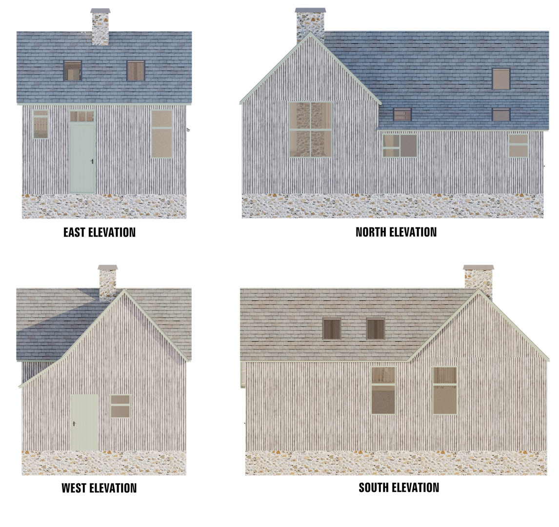
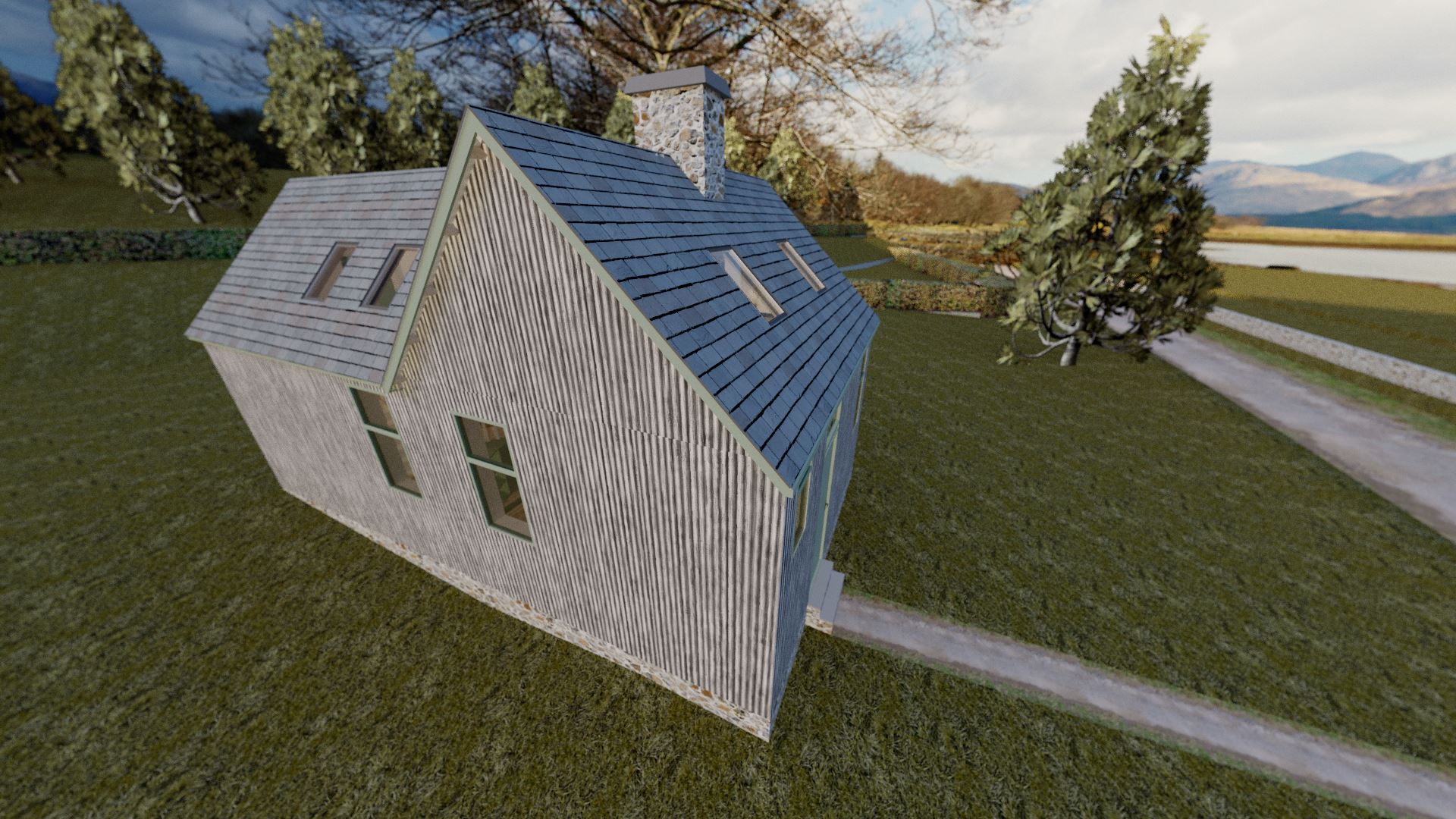
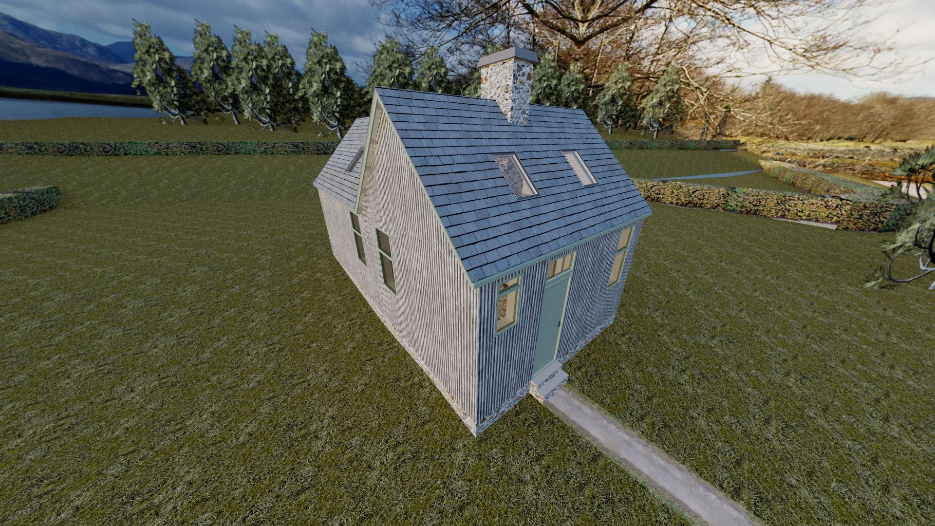
Interestingly, whilst the walls are corrugated iron, the roof is tiled; and it also features a fairly substantial stone chimney. Whilst I could roughly measure the buildings footprint via satellite maps, it took a lot of trial and error to work out the rough height of the walls. My original design looked far too squat, and as the aforementioned records mentioned, whilst it is single storey, it is above average height. All in all, the front door seems to be a whopping 2.4m high; no wonder I was initially confused! The height of the walls and windows really is odd, but I do know that a lot of these early schools were designed to have windows lifted high off the ground to stop children inside getting distracted by what was going on outside. Assumedly, in order to make the whole structure look more balanced, the windows were also enlarged considerably; so we end up with 3m high walls. What looks like a small cottage on the outside actually couldn't be further from the truth! Explore it on Google Streetview, and you'll see the cottage to the south (left side) is much smaller...
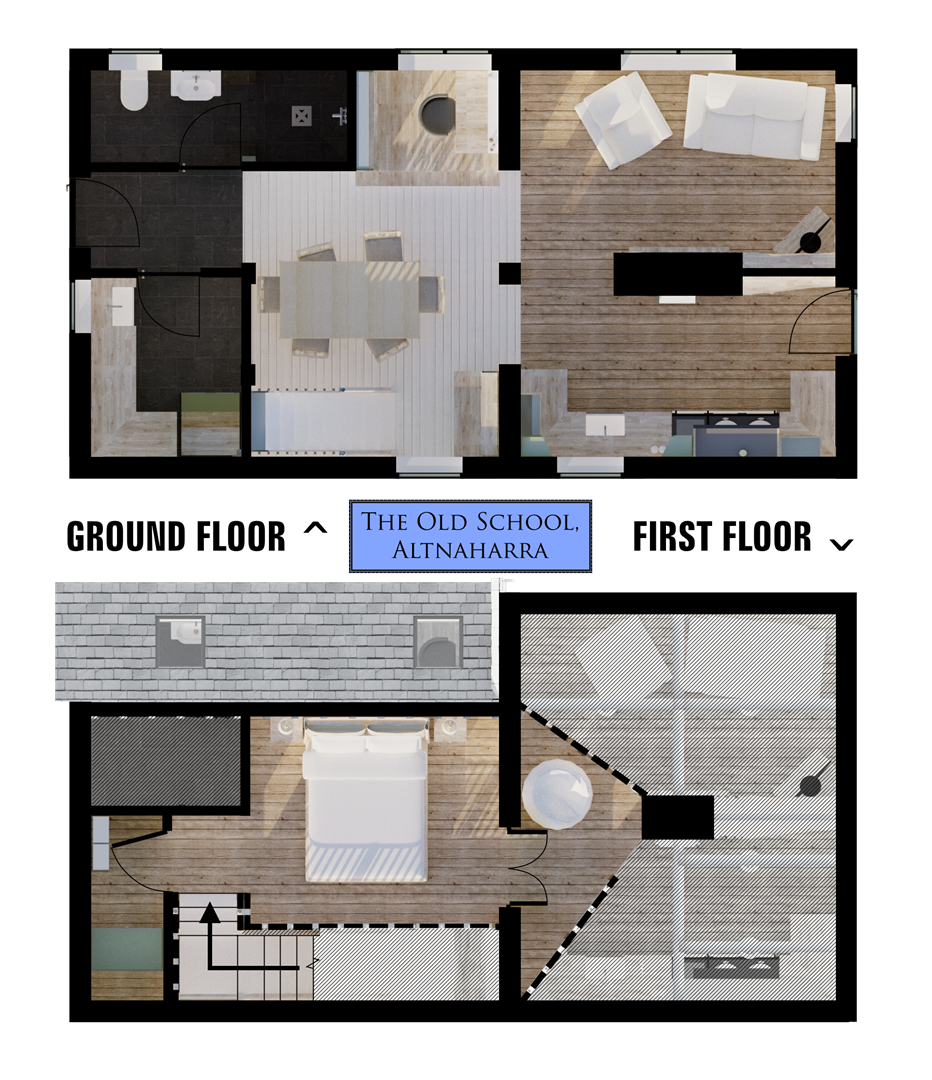
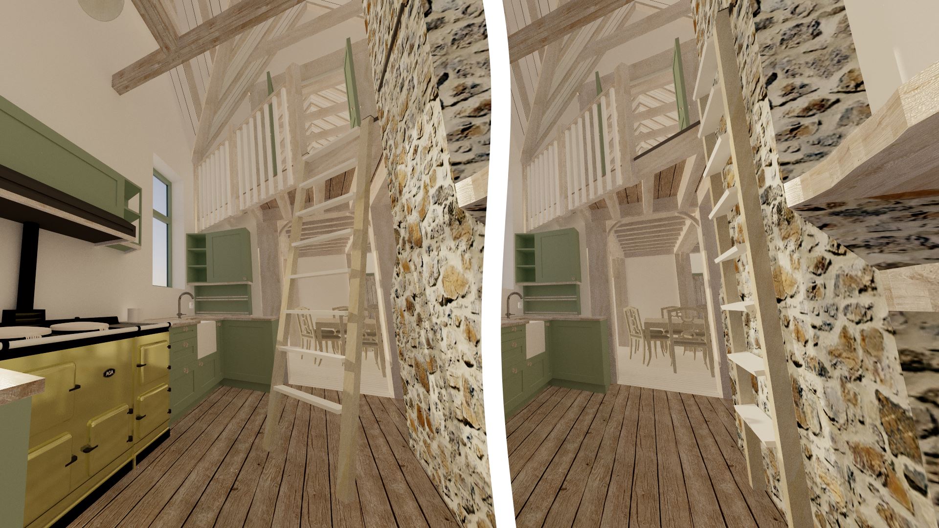
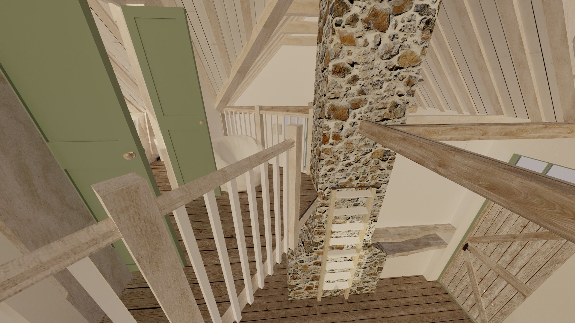
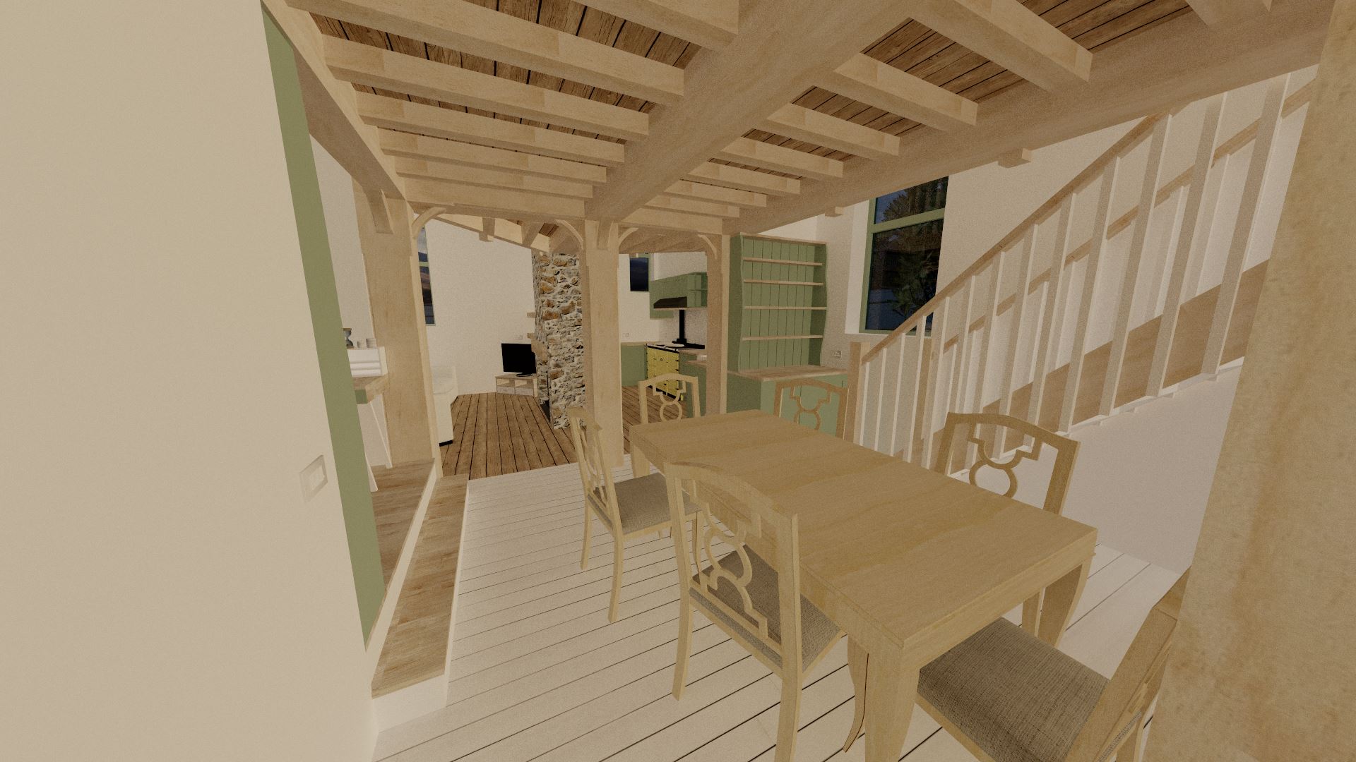
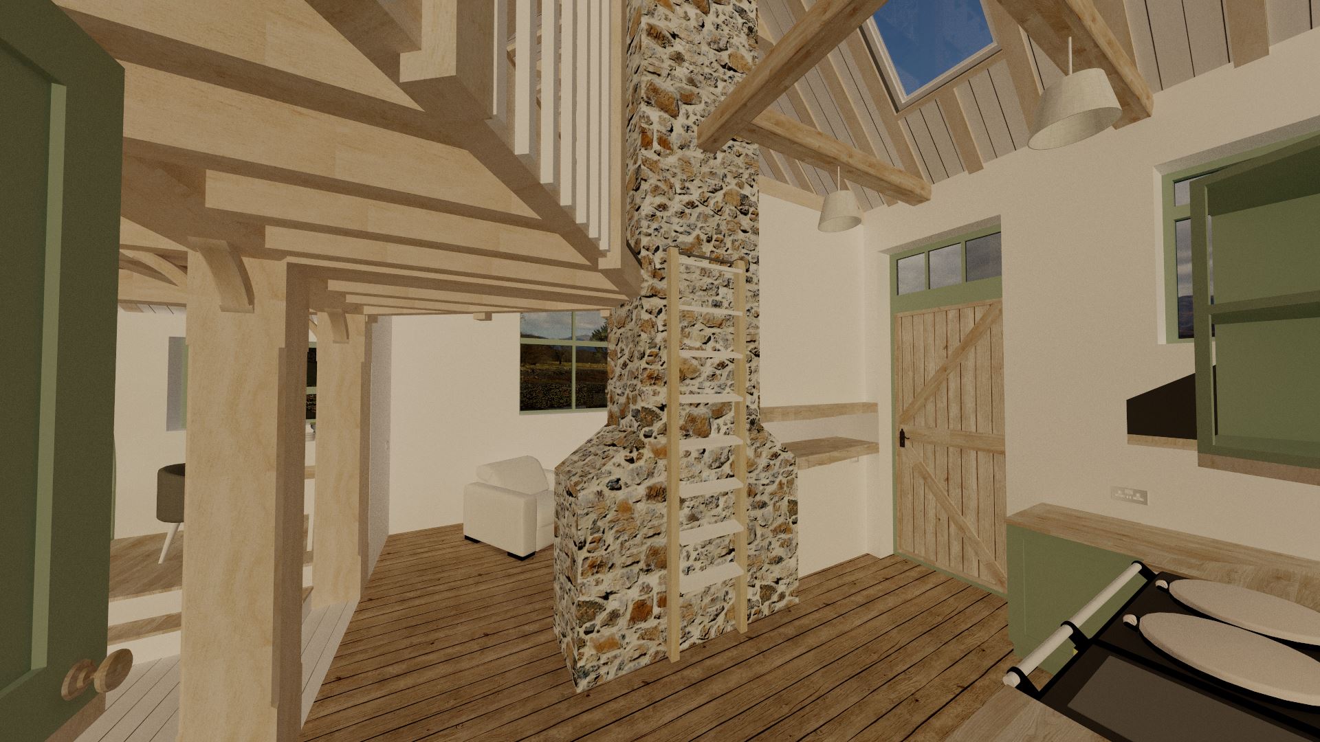
My main aim with this building was to keep it as open-planned as possible. Whilst it's not as small as I originally thought from the outside, I still wanted to make the most of the space. Despite the single storey building being so tall, I wanted to open it up to the rafters to give an even greater sense of space to mimic the remoteness of Altnaharra. The building is formed from two perpendicular sections, which although I've left them separate to some degree, I have added wide openings between the two. I have no photos of the original interior at all, but I would imagine one half of the building was the school, and the other half was the separate post office. I would also presume that the chimney splits the front half into two rooms; although I'm not sure whether both had access to a fireplace. Either way, the end result with my design is a relatively open-plan kitchen, lounge, and dining room downstairs; with two small rooms for the utility and bathroom.
The entire upstairs sits on a new oak frame, and features a bedroom, walk-in wardrobe, and a small mezzanine chillout area that looks out over the open-plan kitchen and lounge. I've also added a considerable number of Velux rooflights to let more natural light in.
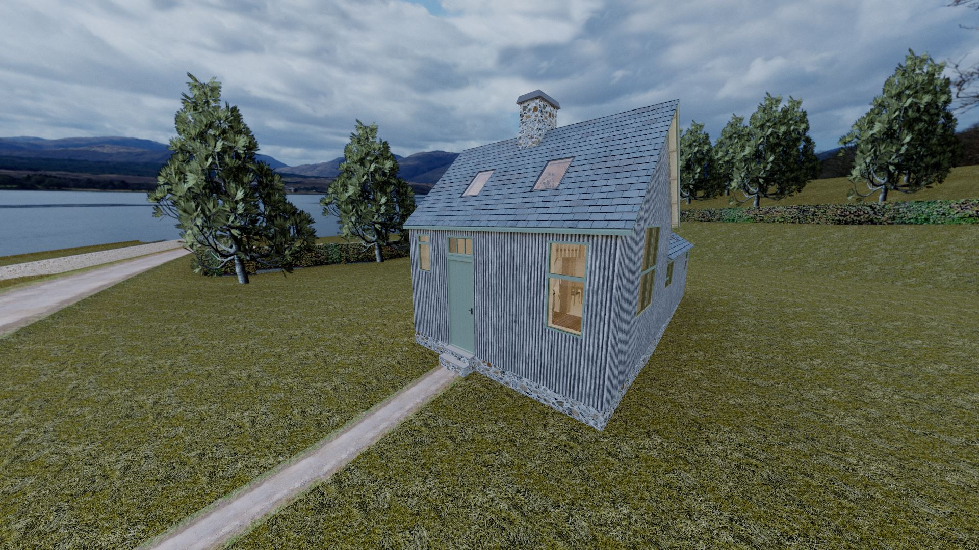
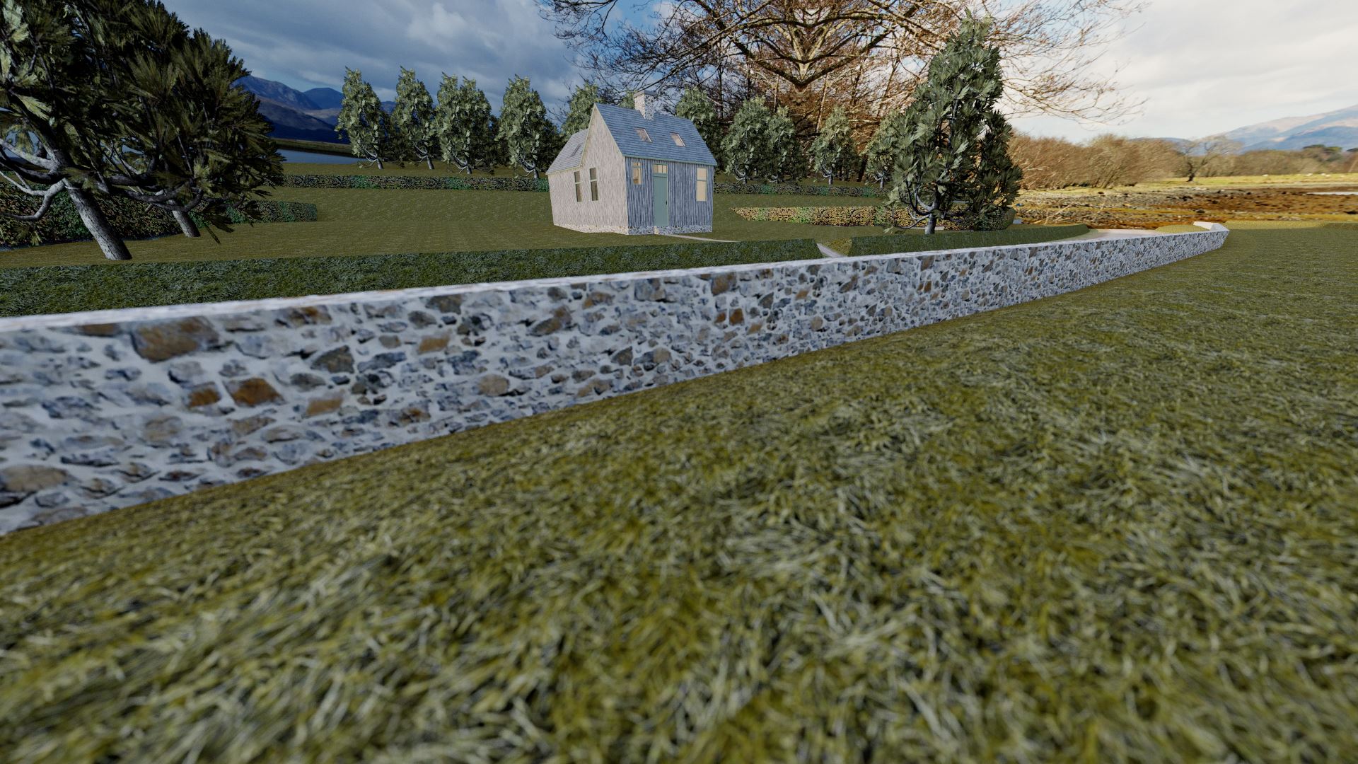
In my design brief, I said that I did not wish to modify the exterior of the building other than by adding rooflights. Usually this would be because the building is either listed, or is of historical importance. Despite the age and original purposes of it, surprisingly it is neither listed, nor historic; so is not subject to many planning constraints. Despite that, I wanted to approach it as if it was. Whenever I convert a building, I like to leave as much of the history of that building intact. To me, it seems absolutely wrong to produce an unsympathetic design that does away with distinct features and architectural styles in favour of a more practical and/or comfortable house. Personally, I feel we owe it to these old buildings to be respectful to their original architects.

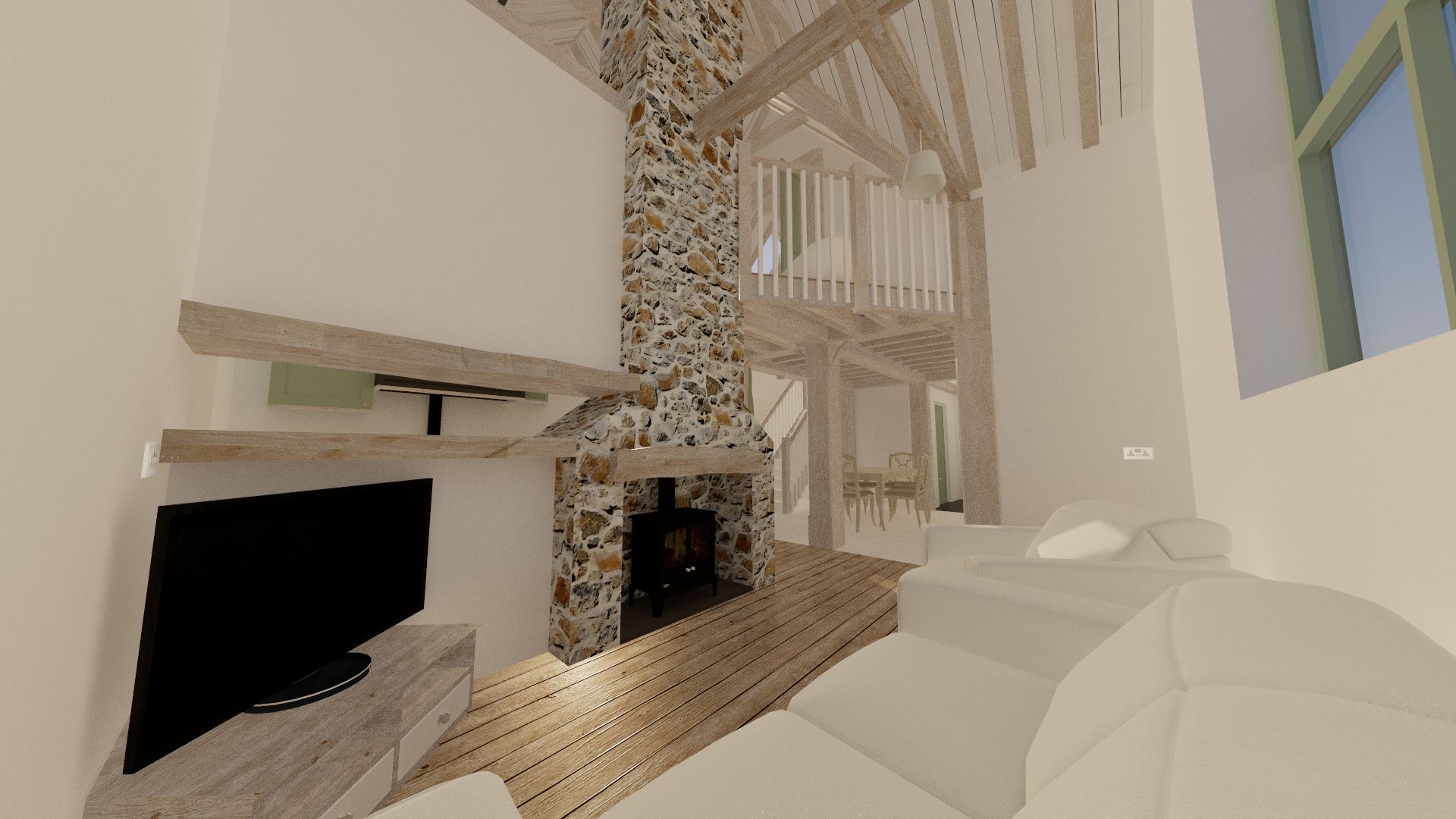
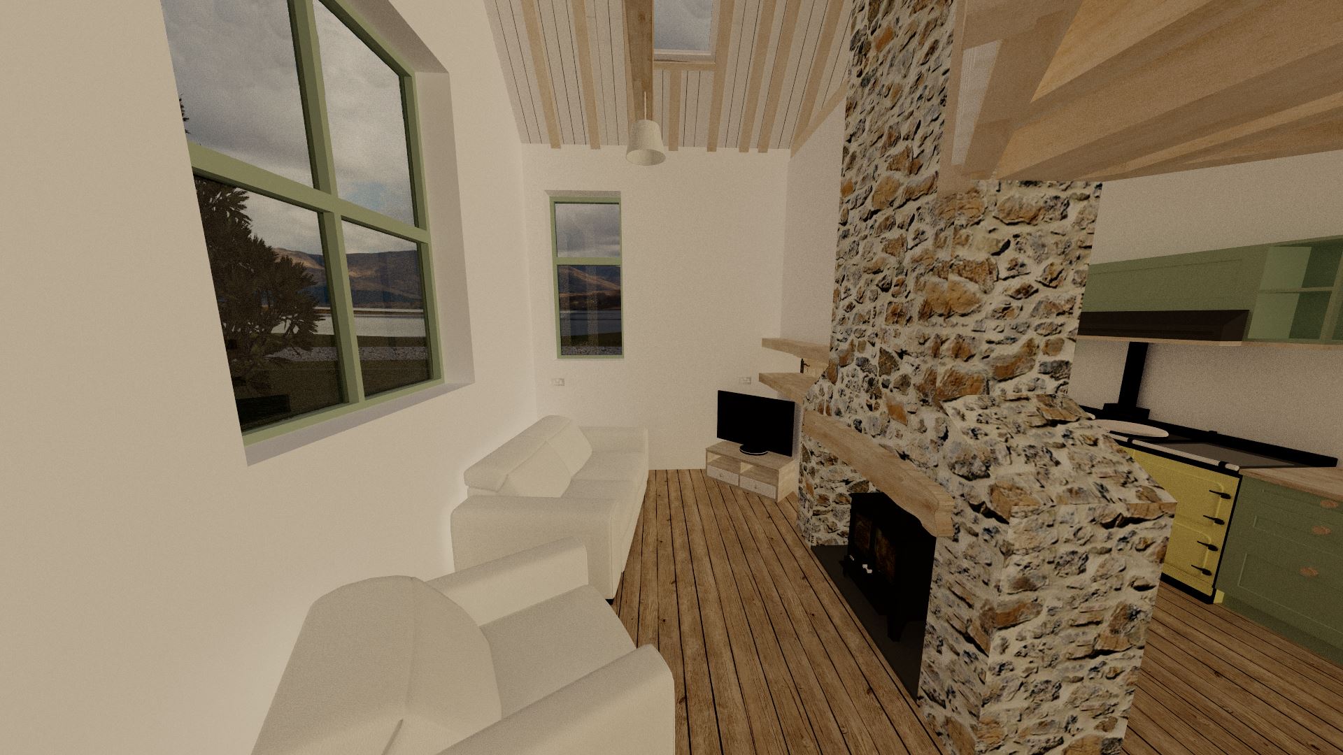
The front half of the building is dedicated to the two main living spaces; the kitchen and the lounge. Whilst open plan, there is still a partial wall and a chimney separating the two spaces. My favourite design feature can be found here; the slot. This is mostly just an architectural feature, but it is nice to have a sightline to the front door from the lounge.
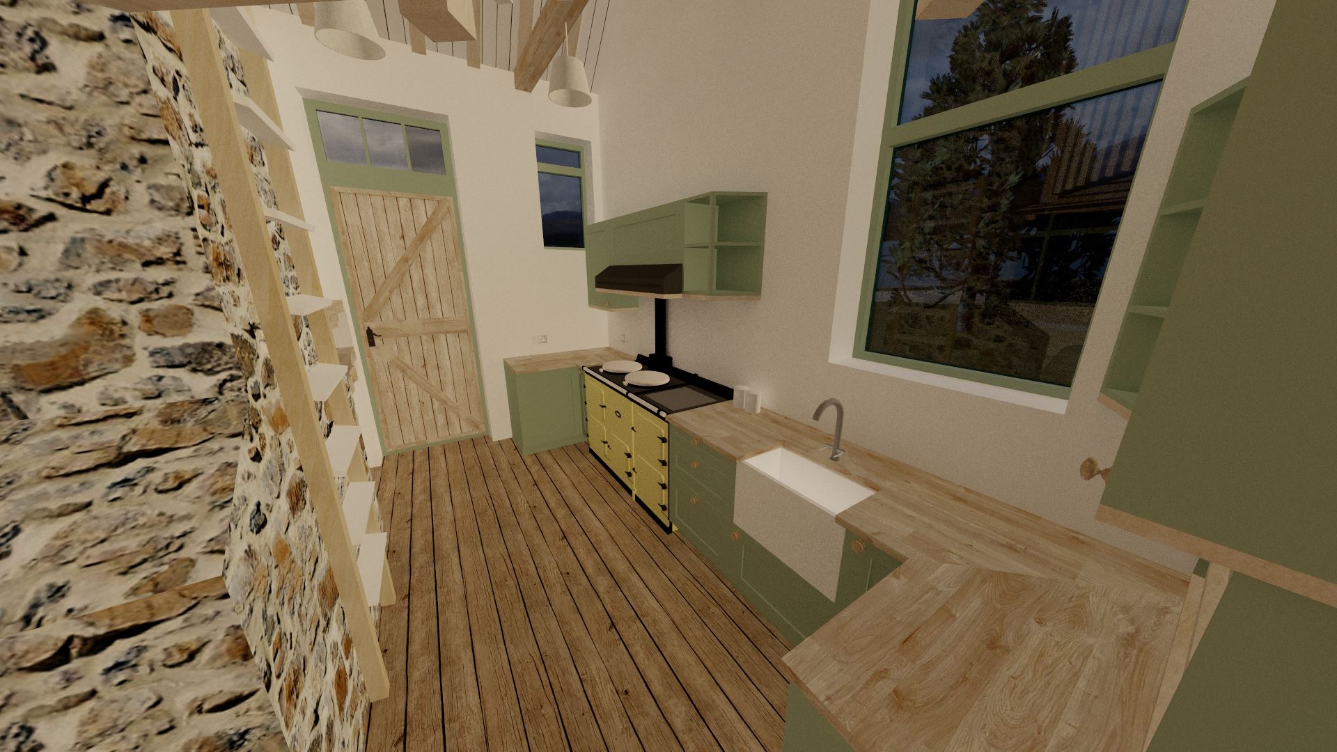
The kitchen is a pretty standard design, although I admit I totally forgot to add a fridge! A bit of shuffling around may be needed to fit in a full height fridge, but it is best placed at one end of the room. In any case, as you can see I've gone for a traditional country kitchen style; complete with an Aga cooker. The green of the bargeboards and window surrounds has been carried through to a lot of the furniture inside the house itself. To compliment the green, I've added mid-tone wooden worktops, trims, and door knobs to all the units.
Both the kitchen and the lounge feature the same natural wooden flooring. The wood gives a warmth and more cosy atmosphere to the rooms despite the lofty ceilings. I decided to decorate the lounge quite sparingly in order to be a sort of blank canvas; so the only furniture is a white sofa and armchair, and a corner TV bench. There is plenty of room for a sideboard or similar, and you might even be able to squeeze in a coffee table and bookcase if need be. The log burner brings much needed warmth not just to this room, but also to the rest of the house. Alternatively, you could go for a more traditional open fireplace.
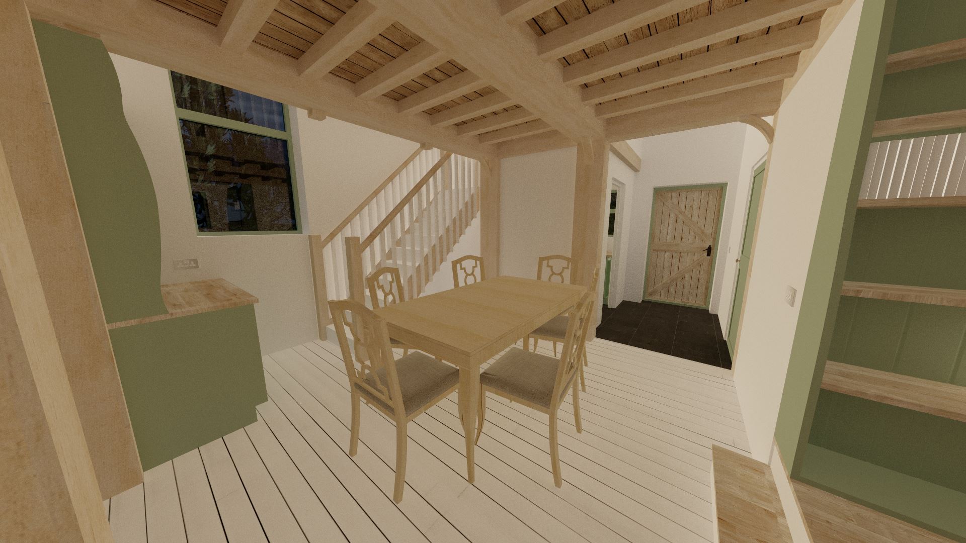
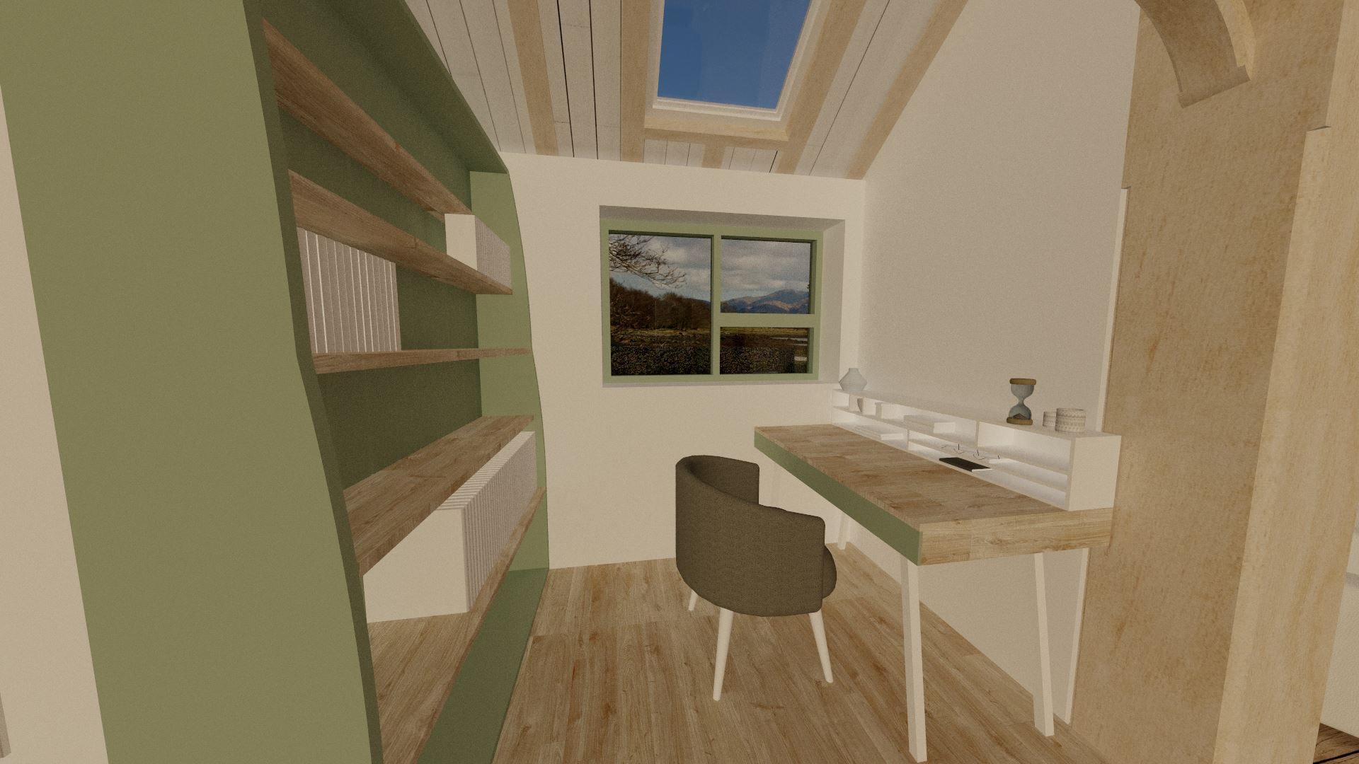
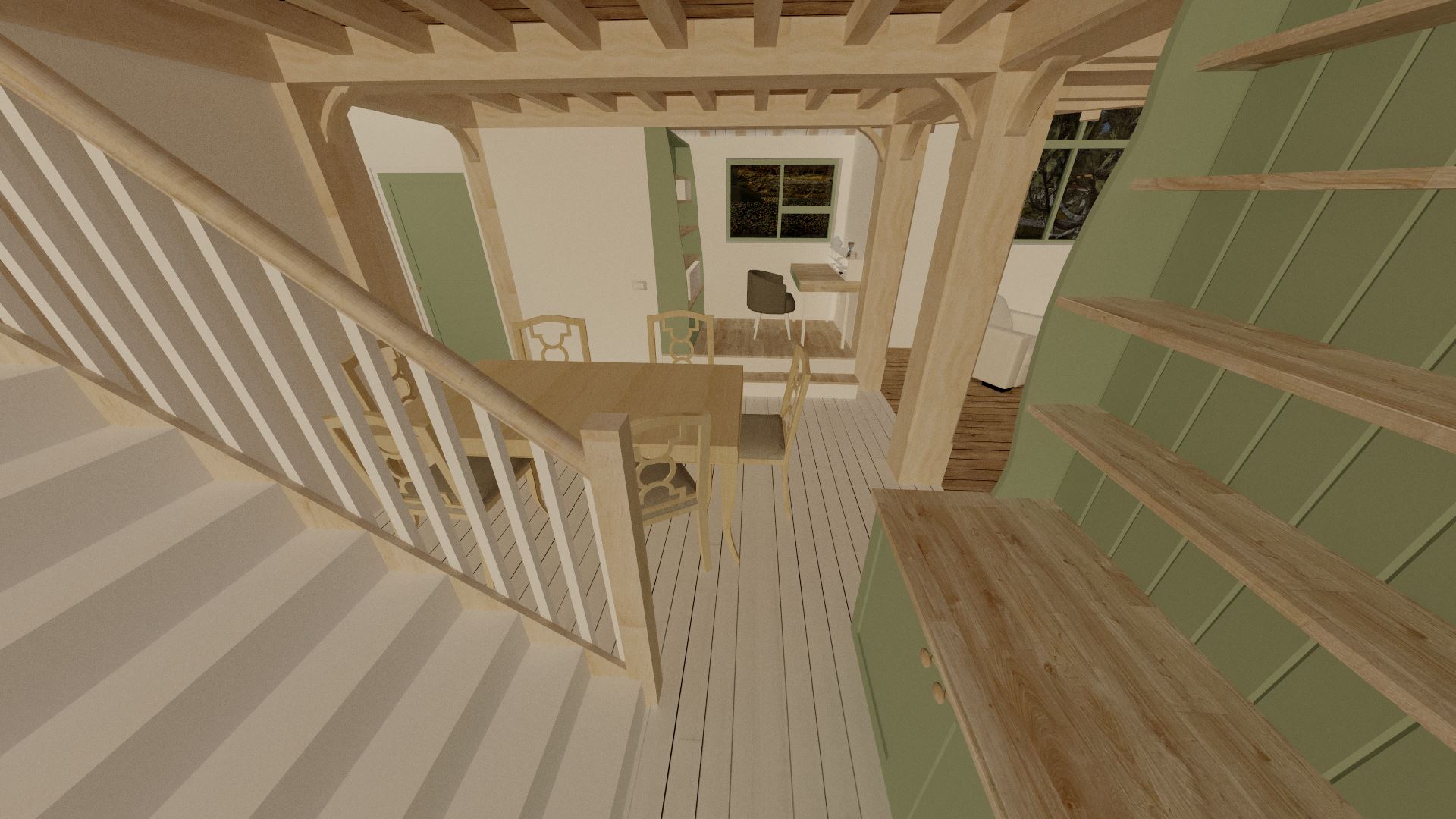
The dining room takes up a large amount of the rear half of the building. Surrounded by a new oak frame, it's in a really traditional farmhouse style; with a large table with 6 chairs around it, and a dresser at the bottom of the stairs. There's room under the stairs for more storage if need be. On the other side to the stairs, there's a small nook which I've added a platform to with two steps. I've shown this used as a home office; pretty mandatory in these Covid times! Anyway, the platform not only separates the space visually, but also allows a much better view out of the window. Don't forget, the windows in this building are placed considerably far up the walls!
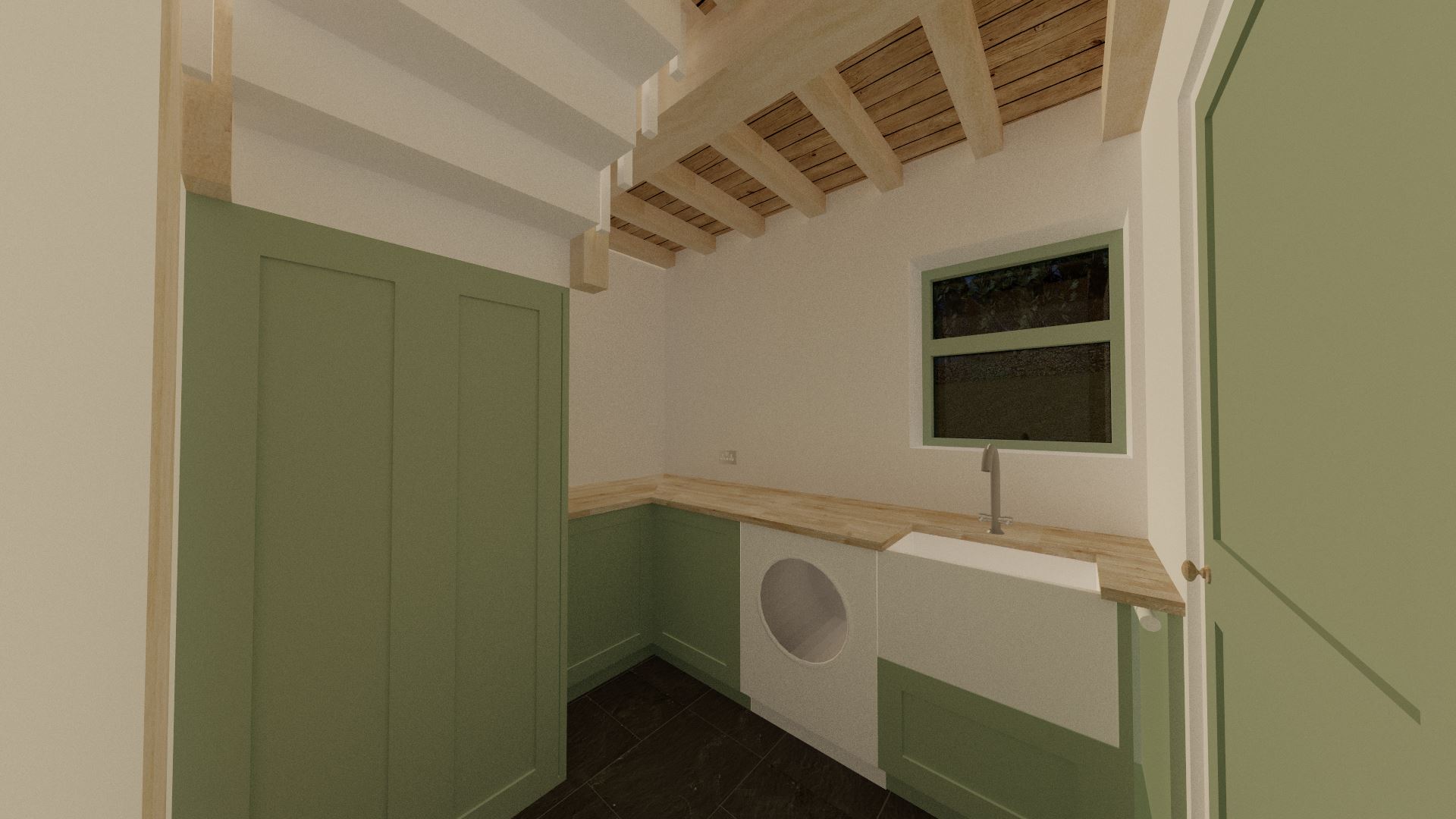
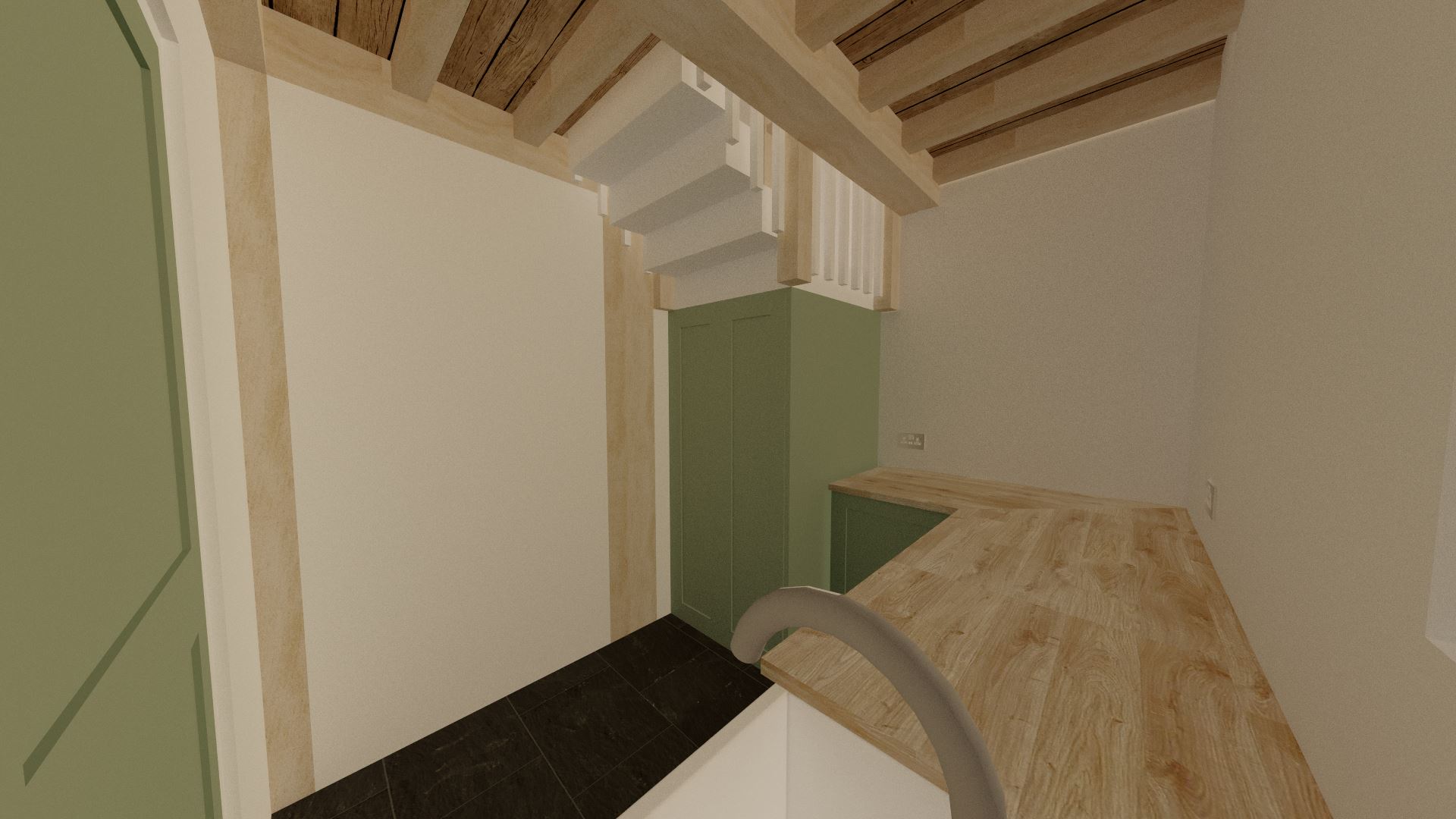
It's not often I have space for a dedicated utility room in my designs, but here we have one with enough room not only for a row of cabinetry, but also a cupboard under the stairs for a vacuum cleaner and other bulky items. The new window added to the rear wall of the building adds much needed light into this dark corner. This is the only room in the building that features a traditional ceiling height!
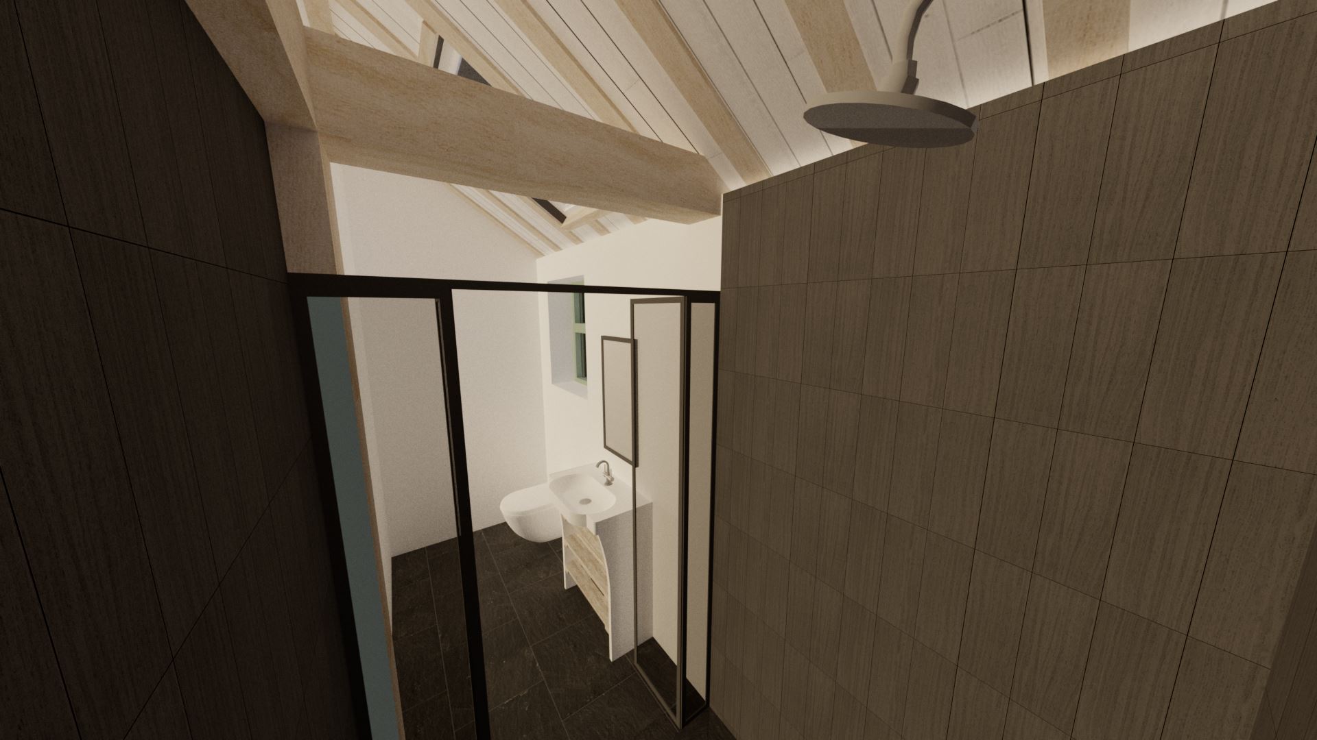
The wetroom isn't big, but does feature a generously sized shower. The whole room fits into part of the north lean-to. Once again, in order to add in more natural light, there's a small Velux rooflight. To contrast with the rest of the interior, I've actually gone for modern style bathroom fixtures. The wall of the shower is tiled with near-black rectangular tiles, with the floor matching the back entrance hallway and utility room. The only real hints of farmhouse style are the exposed oak beams and shelving underneath the sink.

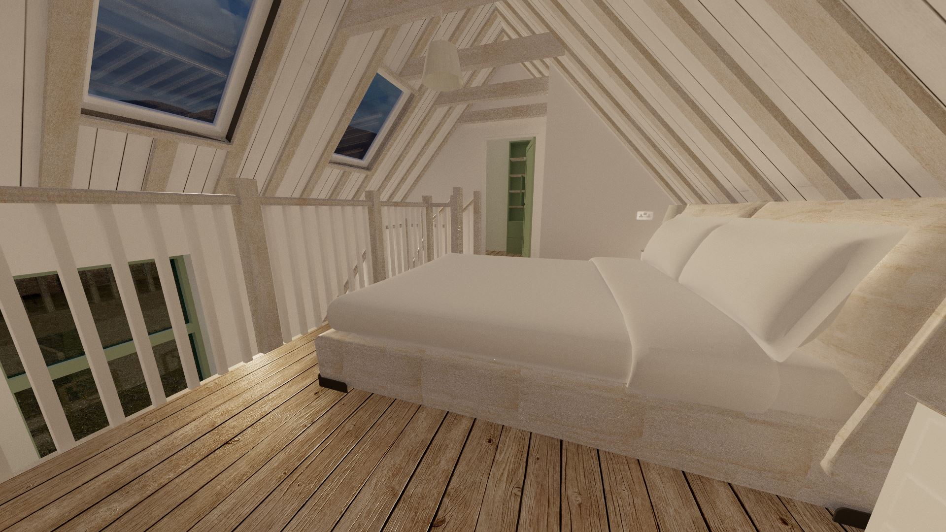
Featuring a king size bed, the bedroom is a pretty decent size. There's enough room for two bedside cabinets, plus potentially shelving either side if more storage space is needed. That said, don't forget that there is an entire walk-in wardrobe that sits above the utility room. And if that still isn't enough room, you could always remove the void above the back door and extend the bedroom over it!
The two Velux rooflights let in plenty of light, and also allow for a really nice view out to the mountains and nearby loch. Unlike most of my usual designs, there's just enough headroom for a proper staircase; making it a very practical room. The double doors lead out to the small mezzanine; which features a beanbag for the ultimate chillout spot. Once again, not only are their skylights here, but the space opens out to both the kitchen and lounge; with great views out many of the windows.
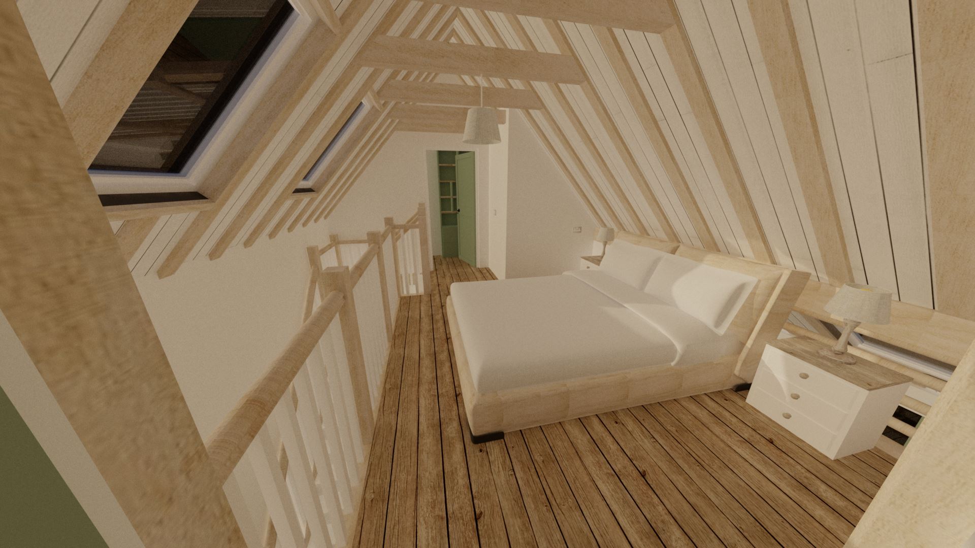


The mezannine is pretty small, and whilst I would've loved to extend it, the kitchen window and the valley of the roof prevented any meaningful extension. That said, it's still a really fun little area, and can be shut off from the bedroom and accessed via the kitchen instead if need be. If nothing else, it would be a nice place to chill with a book and a glass of wine!


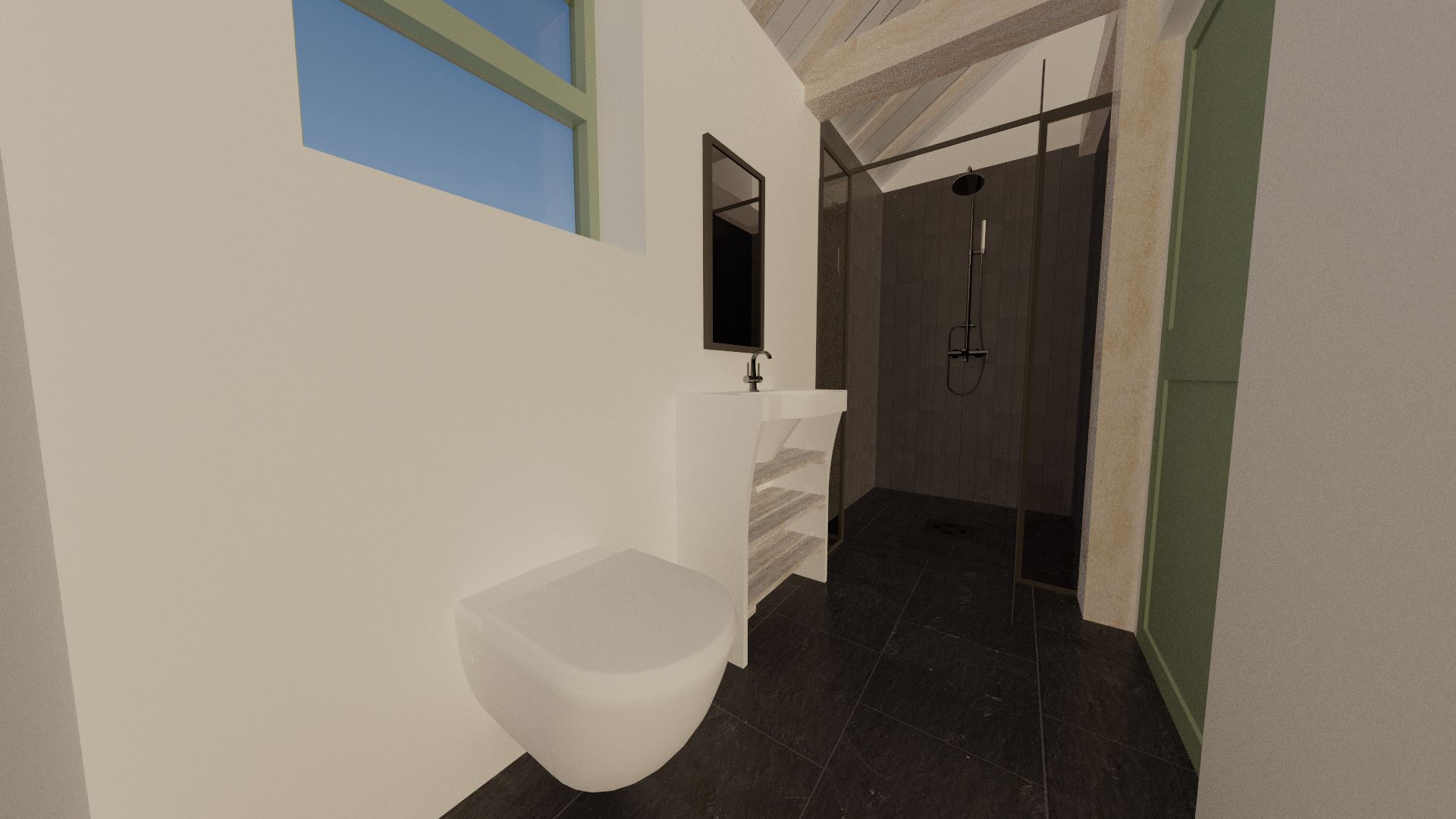


Despite the height of the windows and placement of the chimney giving me some real design headaches, I think the end result is actually one of my best designs yet; for a start, the rooms feel big, bright, and airy. Equally, I don't think I've ever had room for a dedicated utility room before! The wetroom may be a bit small for some, but out of all the rooms I don't see a big bathroom as being worth the extra space. I'd much rather give the space over for rooms you'll be spending a lot of practical time in.
The bedroom and connected mezzanine make the most of the unusual height of the single storey building. Whilst the roof shape meant I couldn't extend the mezzanine over the lounge, I did consider doing so over the kitchen. That would allow for a much larger space, although care would need to be taken not to cover the tall windows; and therefore "step" the mezzanine away from them.
In any case, I hope you enjoyed this blogpost as much as I did making it; even if it is double the size of my normal designs! I always welcome comments and suggestions; so do email me or contact me through the social media buttons at the bottom of any page.
'Till next time,Jam
