Back


A NEW FOREST TINY HOUSE (V1)


Designing a tiny house solely for myself here in the New Forest!

Approx 20m² (215ft²)


NOTE: Click/tap on images with a green border to expand them into a lightbox; then click/tap anywhere again to close.

"PROJECT: SNUGGERY"


In what I’m nicknaming “Project: Snuggery”, I’ve decided to design a series of tiny houses to entirely suit my needs. Whilst I already design all my architectural spaces in a style that I like, I decided that it was about time I take a step towards my dream of building myself a tiny house by designing a few variants specifically for me. As such, some elements may not be suitable for others.

This is the first design, and it's already close to a year old (this is the last tiny house that I designed before I had to stop my regular updates). As such, I can already see things that I would remove or change for the next design, but I'll discuss those at the very end! I suppose I should preface this by saying that this is no guarantee that I will ever build a tiny house, but I sure hope I will in the future! I’ve decided to use the New Forest Design Guide, produced by the New Forest National Park Authority (NFNPA), in an assumption that I will still be living nearby. This helps me to ensure that I'm conciously designing these tiny houses with the criteria set forth by the planning authority in mind; hopefully to give me the best chance at a successful application in the future!


DESIGN BRIEF:
To be included:


  •  As always; plenty of natural light!
  •  Space for my composing desk and chair
  •  Plenty of storage!
  •  A compact, yet functional kitchen
  •  A wetroom
  •  An open plan layout, but with obvious demarcations
  •  A sleeping loft with access stairs and a rooflight
  •  An outside decking for the summer months!
  •  Interesting aesthetic details that double up as useful features
  •  A large bi-fold door for light, easy access, and to bring the outside in!
  •  Lighting and electric sockets in convenient places
  •  An exterior that would not look too out of place in The New Forest
  •  Roof heights (i.e. visual impact) to be reduced wherever possible

To be avoided:


  •  Wasted space (like corridors)
  •  Unnecessary glazed fenestration
  •  Any gangways narrower than 600mm
  •  Excess width (certainly must be kept under 2.5m)
  •  Excess height (must be kept under 4.5m)
  •  Excess length (the shorter, the better)
  •  Exterior materials/styles that are out-of-keeping with the natural environment
  •  Unnecessary rooflines (roofs should slop wherever possible to minimise impact)
NEW FOREST DESIGN PRINCIPLES:
GENERAL:


  • Small spans and modest elements and openings
  • Use a range of local materials that tone well with natural features
  • New developments should scale to neighbouring buildings
  • Additional accommodation should be low key (i.e. lean-tos)
  • To offset a large main building, add smaller ancillary elements around/attached to it
  • Contrasts of materials can add to the aesthetic
  • Use native species of hedgerow, simple fencing, and subtle gates
  • To reduce monolithic buildings with large roofs, use double pile living - i.e. split building into two halves; both with gable ends
  • Think about small details like decorative bargeboards found on traditional forest architecture
  • Avoid high-impact upper floor accomodation
  • Link two buildings via small glazed sections
  • Keep front (roadway-facing) fenestration modest and forest-like
  • Keep large flazed areas towards the rear
GREEN CREDENTIALS:


  • Recycling and re-using existing buildings
  • Flexible, organic design
  • Simplistic design, and preparing for the future
  • Sourcing materials locally
  • Offsetting high energy cost materials like glass and steel with traditional materials like timber framing
  • Placing ancillary buildings separately to provide cost effective heating and reduce energy usage
  • Adding green roofs and solar panels (solar panels can be integrated into canopies, a lean-to, a lantern, or an outbuilding to lessen their impact)
  • Recycling found materials
  • Recycling grey water, and rainwater harvesting
  • Face habitable accommodation within 30 degrees of south (for maximum light)
  • Zone service areas (utility rooms etc) to the rear (north)
OFFSETTING GLAZING:


  • Overhanging eaves
  • Recessed windows/setting them back from a corner
  • Pergolas or tellis
  • Subdivided between and/or behind robust timbers
LOCAL MATERIALS:


  • Thatch
  • Clay roof tiles, or Welsh slate
  • Lead
  • Corrugation
  • Cob or render
  • Plum/orange or buff brick
  • Timber cladding
CONTEMPORARY METHODS:


  • SIPS (insulated panels)
  • Green roofs
  • Structural glass
  • Straw bales
  • Mirror glass
  • Oak shingles (avoid cedar due to acid run-off)
FINISHES:


  • Granular finishes accelerate weathering and allow moss to gather, especially on north-facing elevations
  • Timbers left to naturally weather (i.e. oak)
  • Small, rather than large tiles
  • Feather edge boarding should be sizable to look rural

THE FLOORPLAN:
Length: 5.4m | Width: 2.44m | Height: 4m (2.4m at lowest point)
THE LAYOUT:


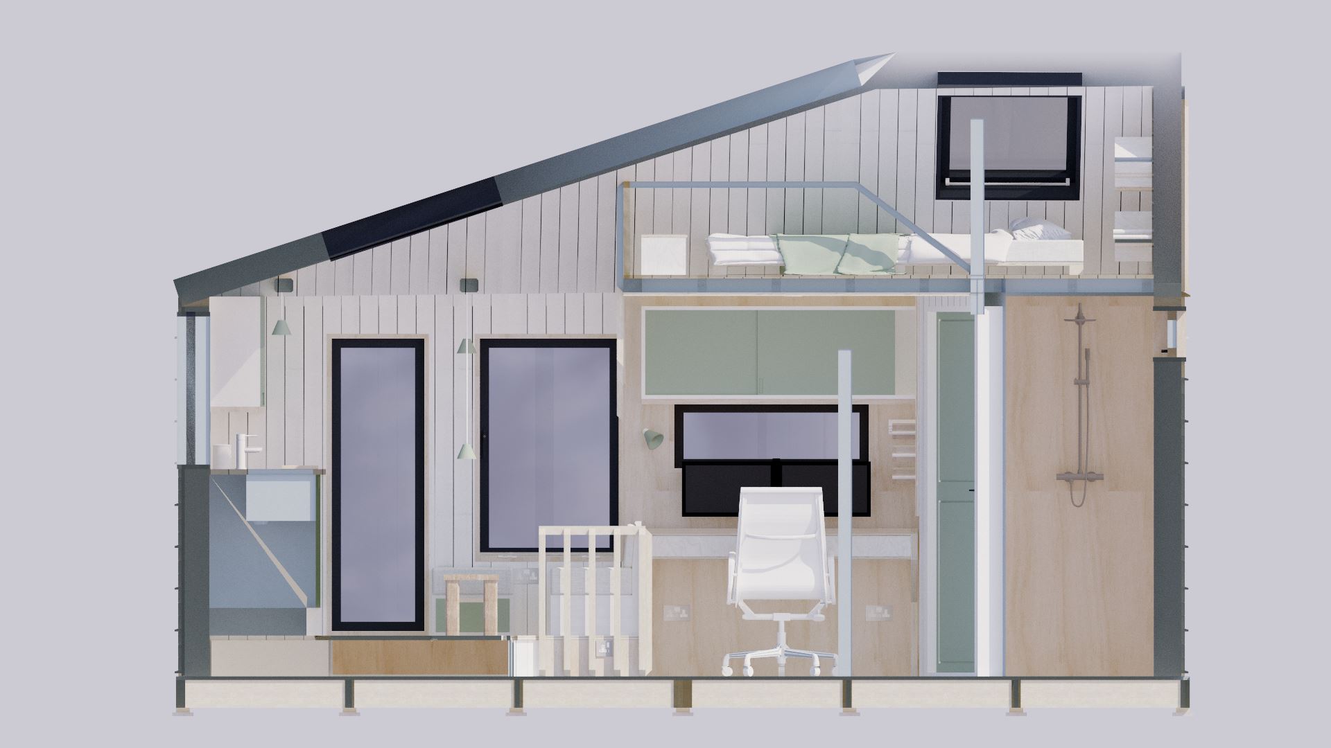
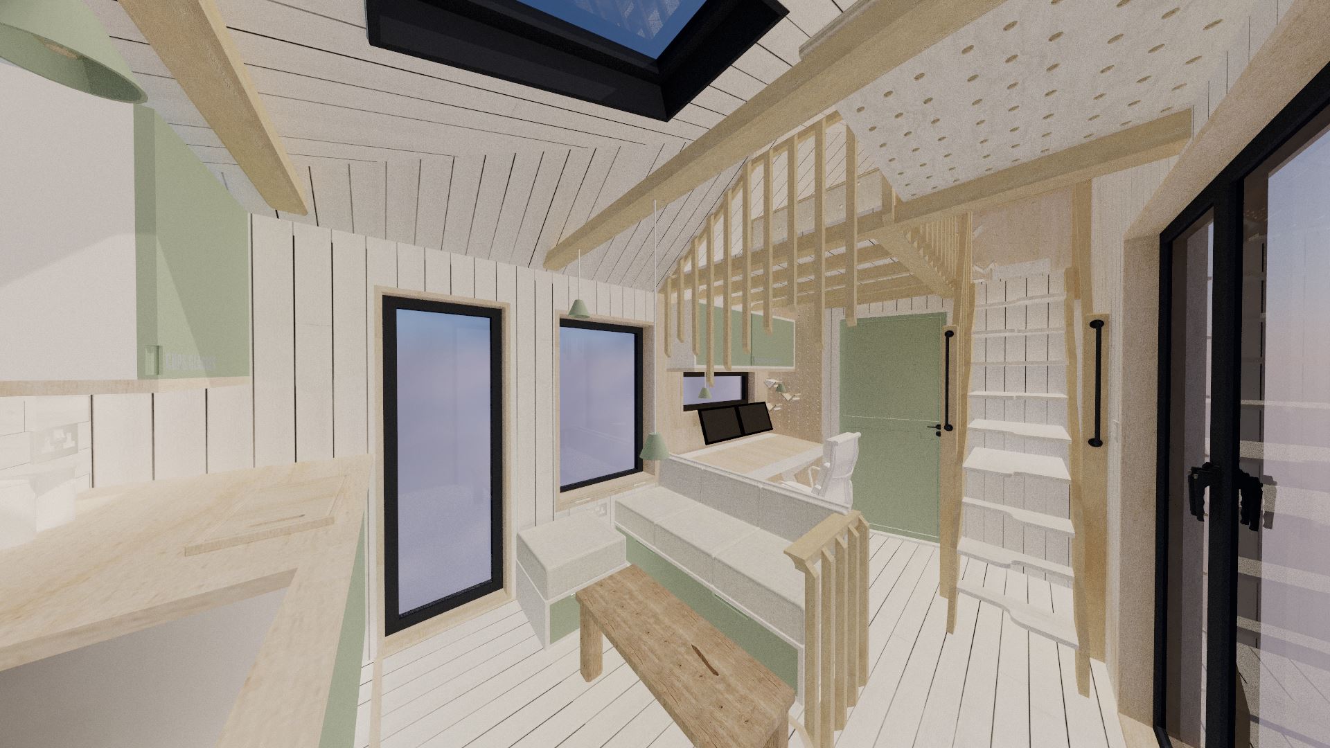
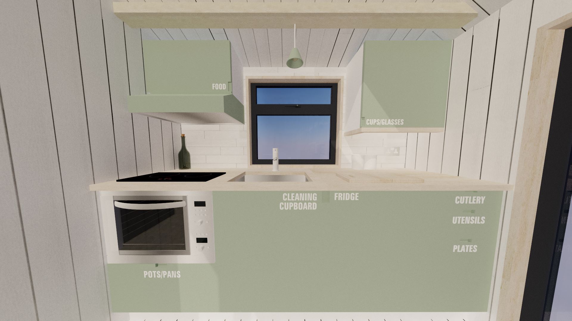
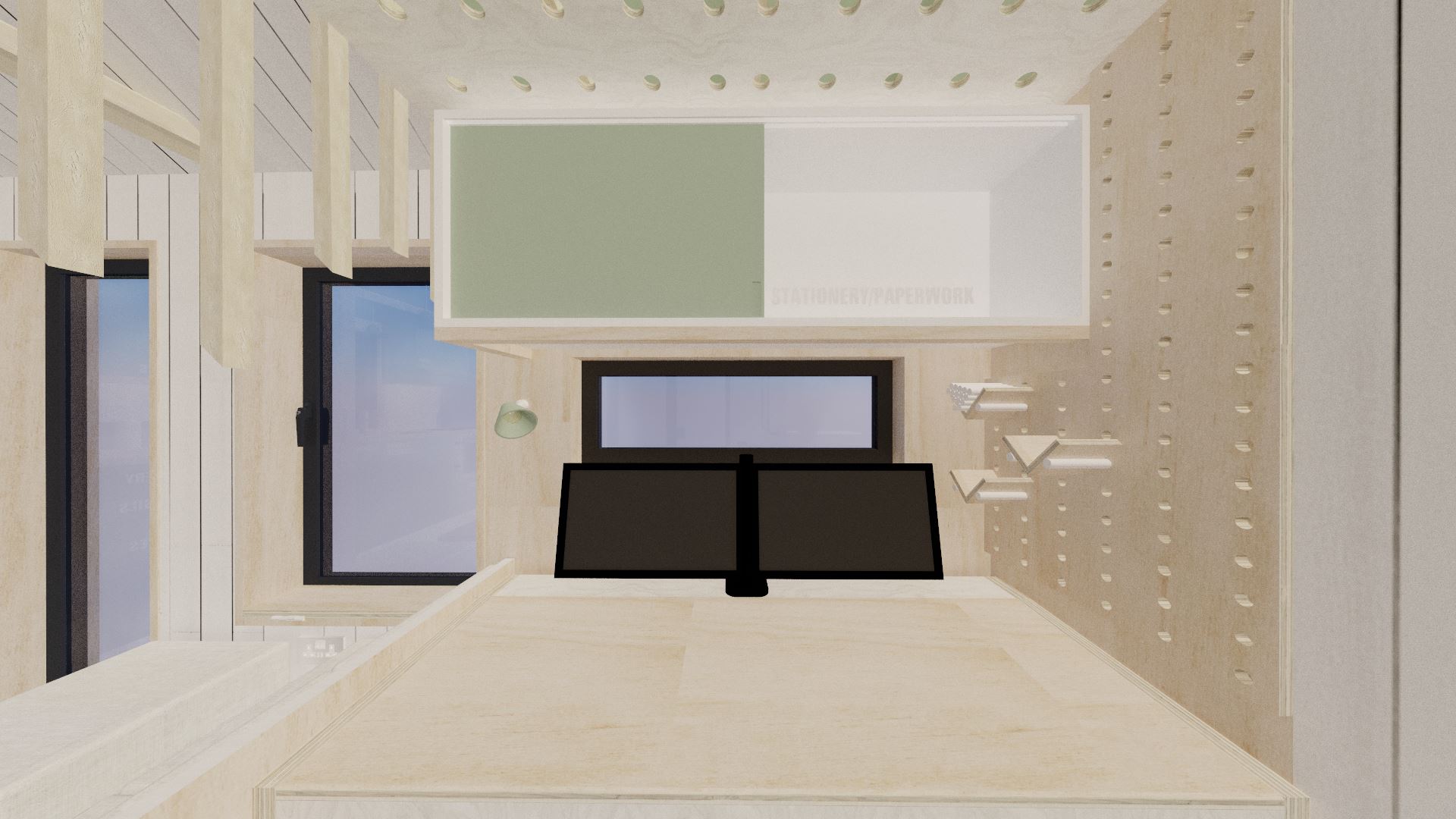
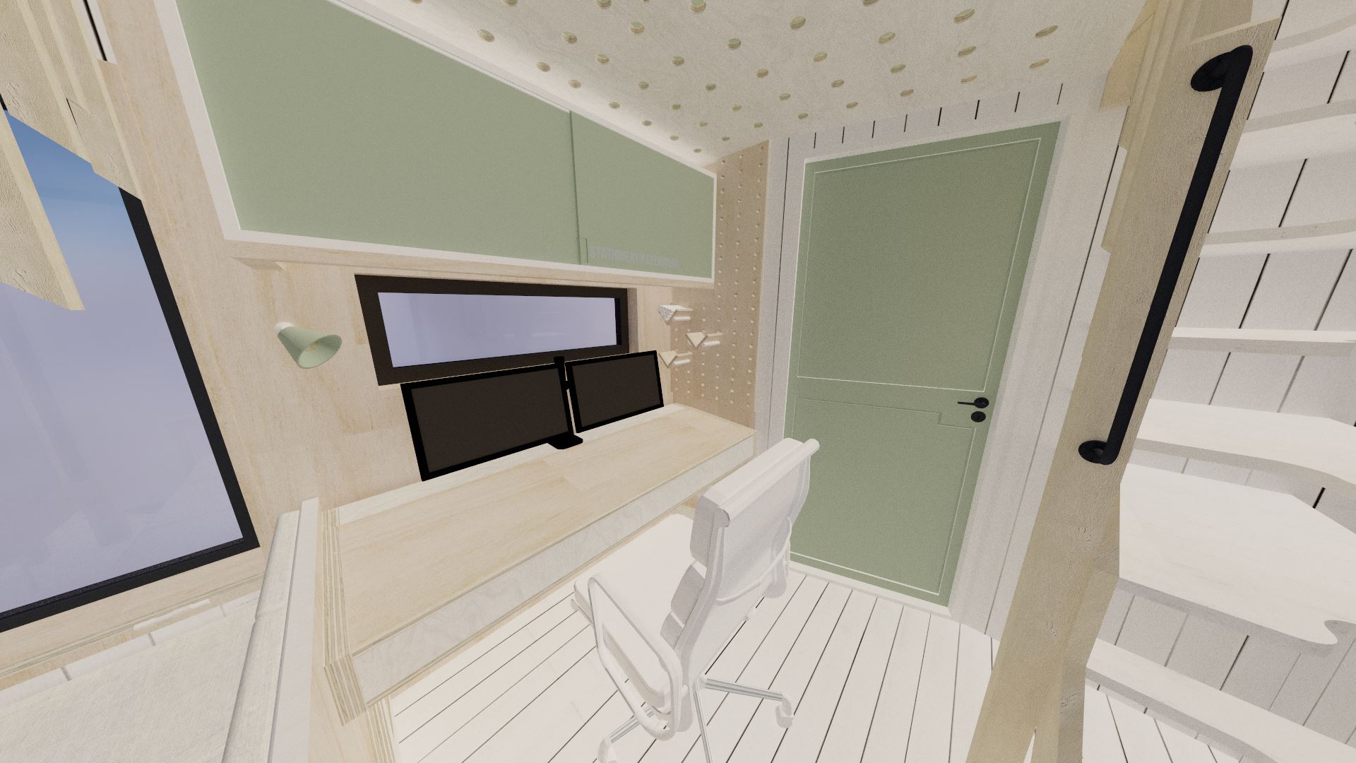
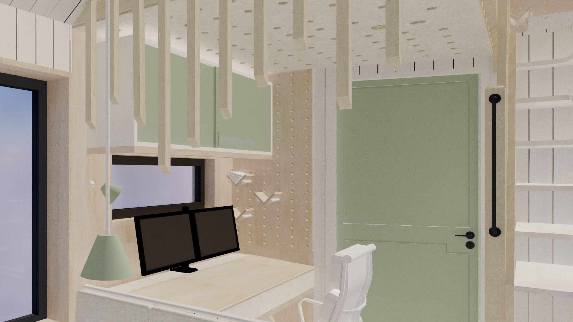
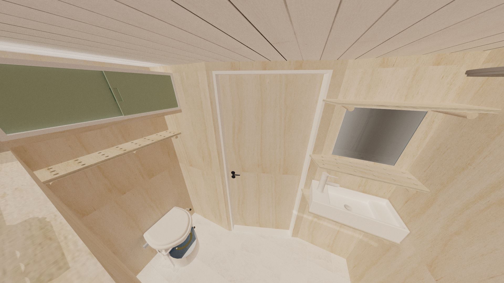
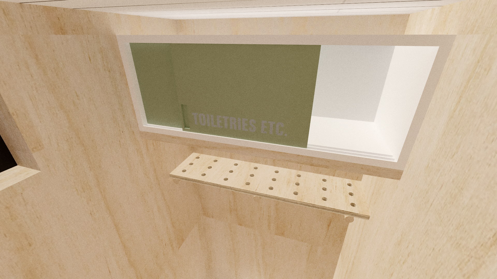
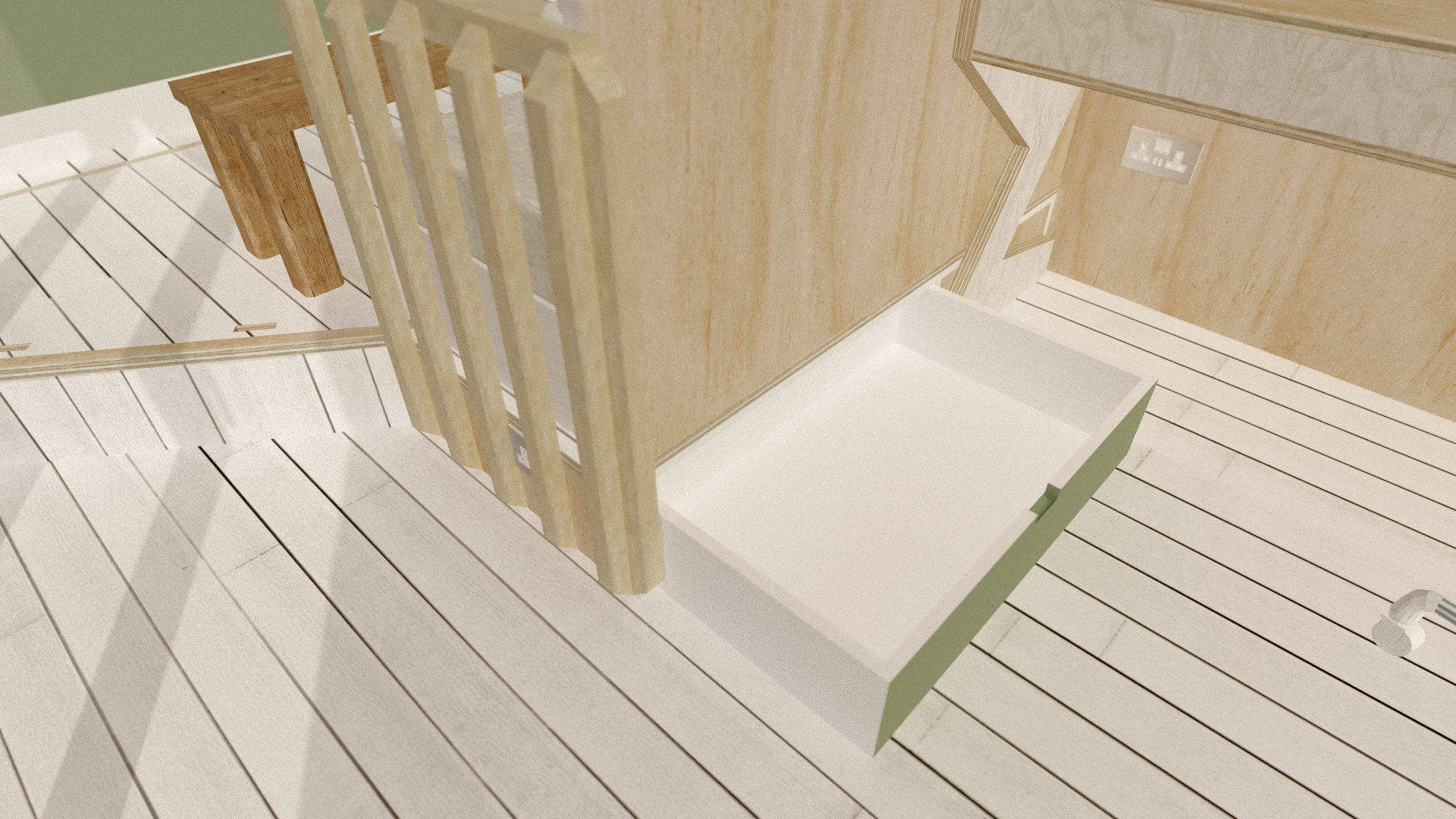
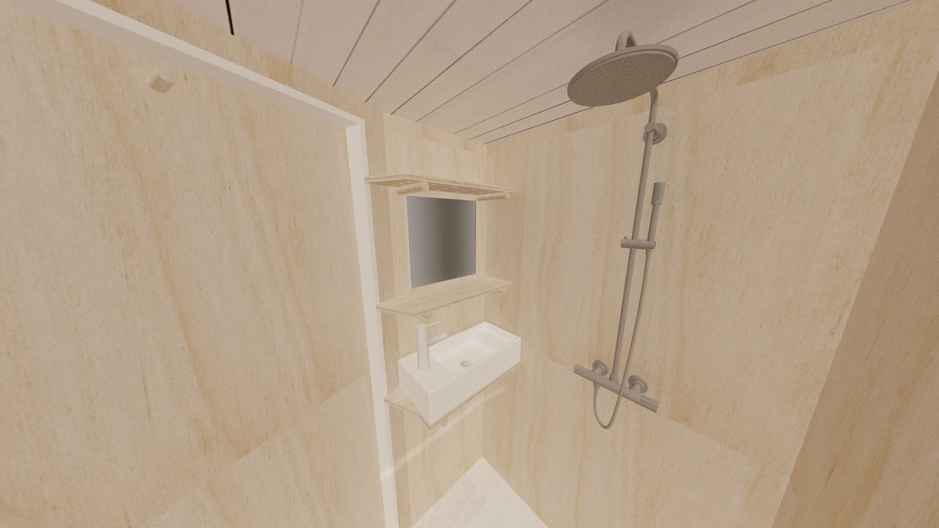
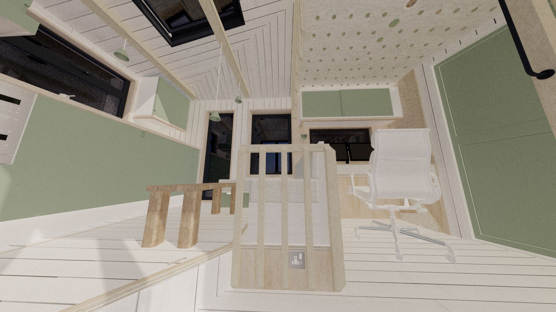
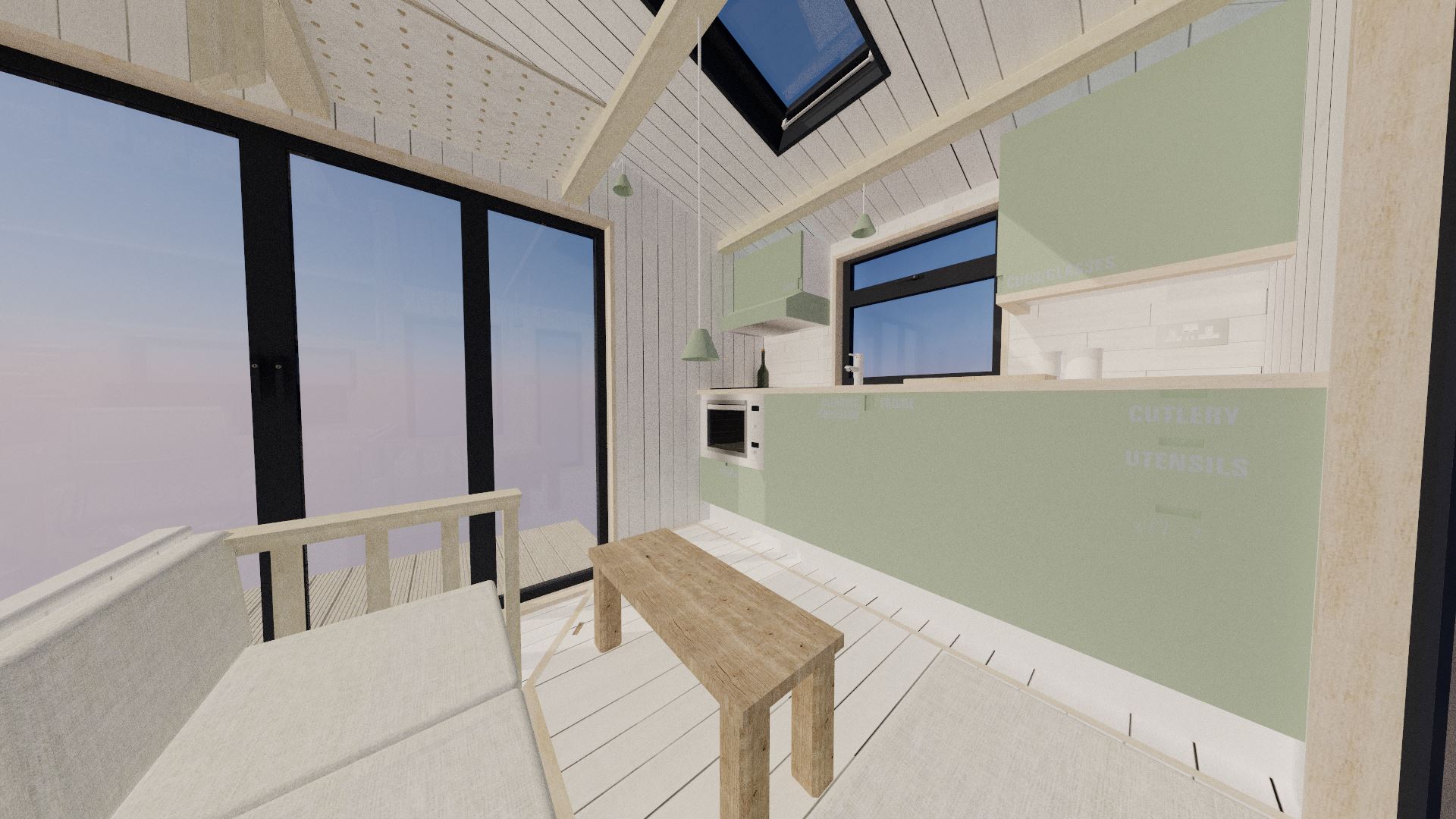
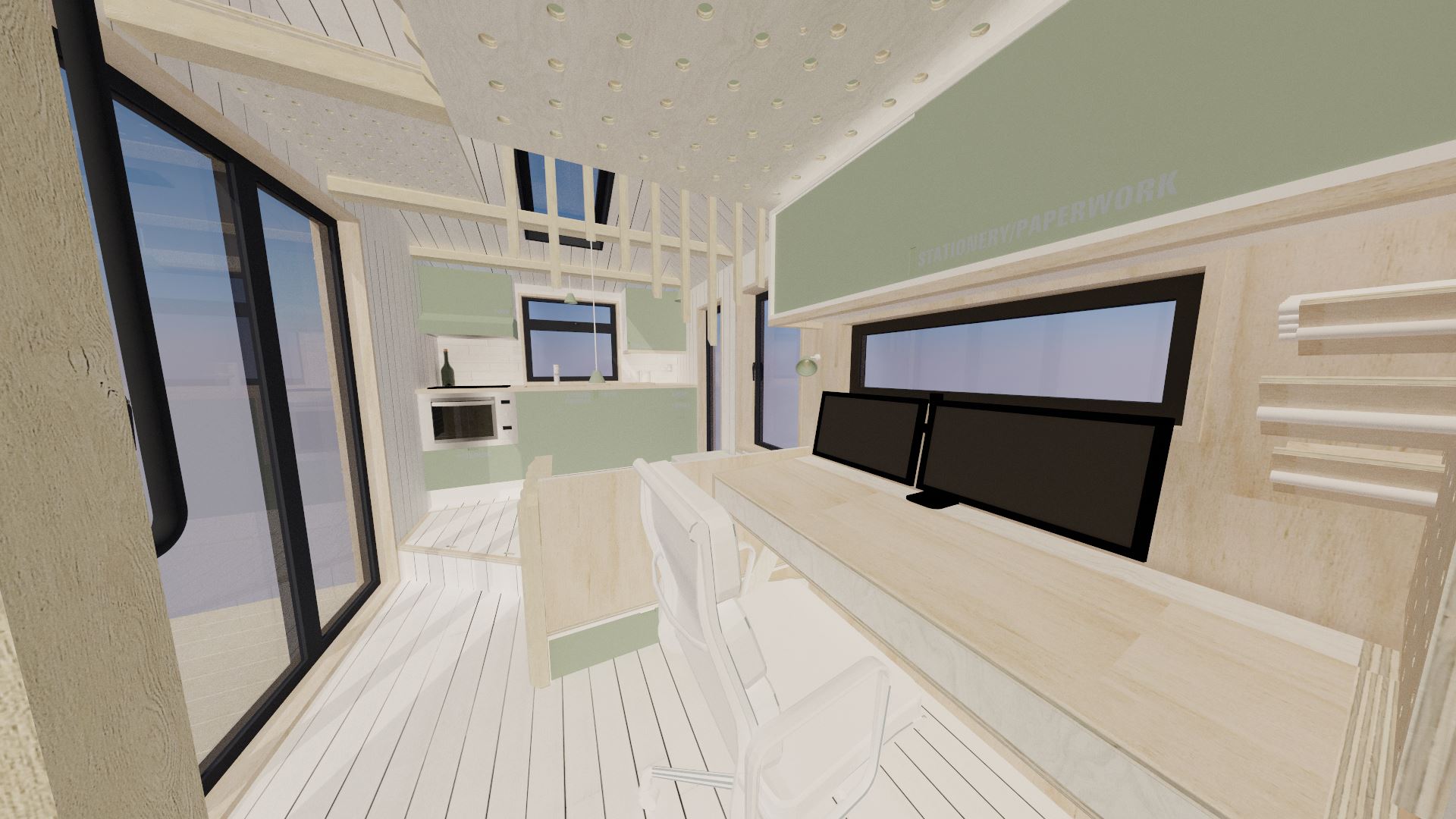
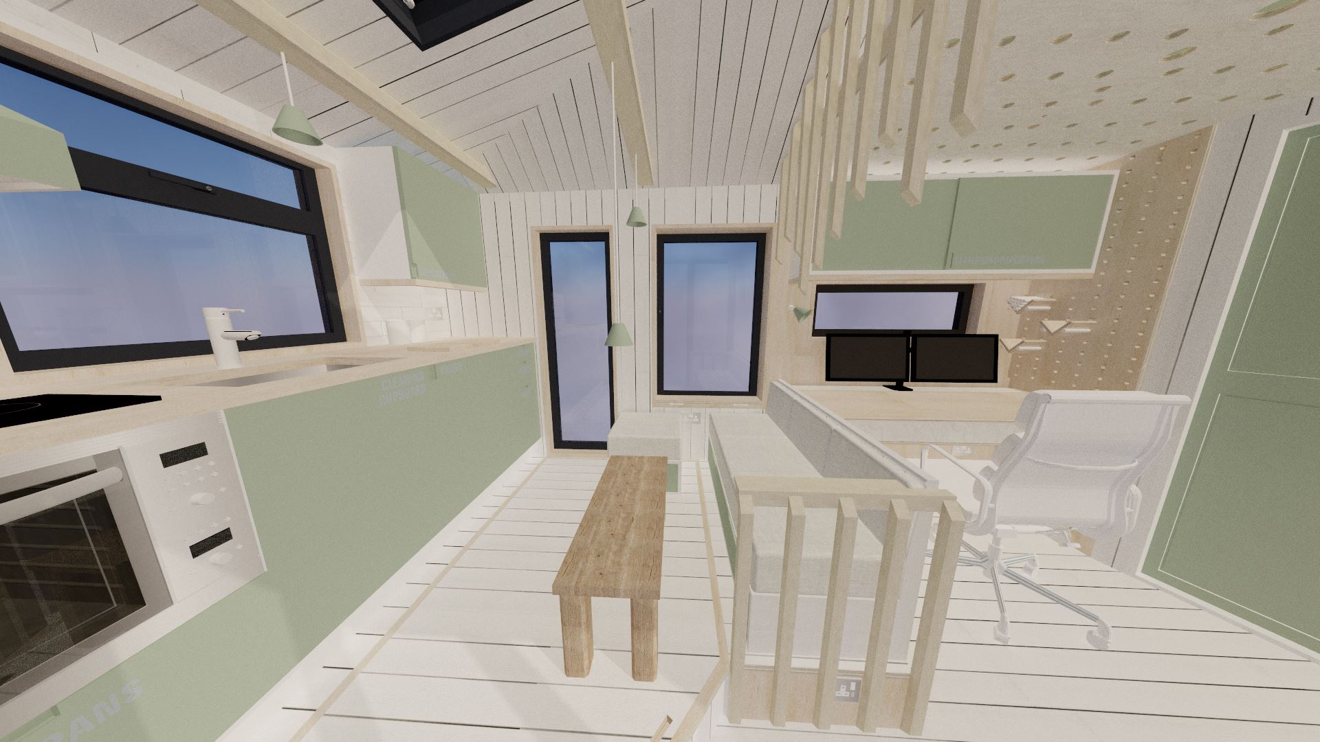
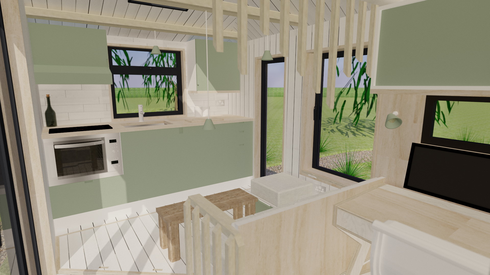
As I said earlier, this tiny house is designed only with my needs and desires in mind. As such, the most important bit of furniture to fit in was my composing desk; at 1400mm x 700mm, it’s a really big bit of furniture to fit in a tiny house, as it can only be placed against one of the long side walls! I’ve seen some tiny house musicians hang their music keyboards on their walls, but at 25kg, that’s a no-go with mine, hence why I need my custom desk to permanently keep it accessible. To make the most of the space (and to avoid having a corridor), the wetroom was located on one end of the building, and the wall doglegs in order to make more room for the stairs. Whilst I usually add kitchens/kitchenettes along a long side wall, to open up the space in the middle for the desk and sofa, I decided to locate it on the opposite end of the tiny house to the wetroom. The only downside is that plumbing now has to run the full length of the tiny house, although the further apart the two rooms are, the more hygienic it is. Having a bathroom open into a kitchen should usually be avoided (although a fair number of my designs do suffer from that).

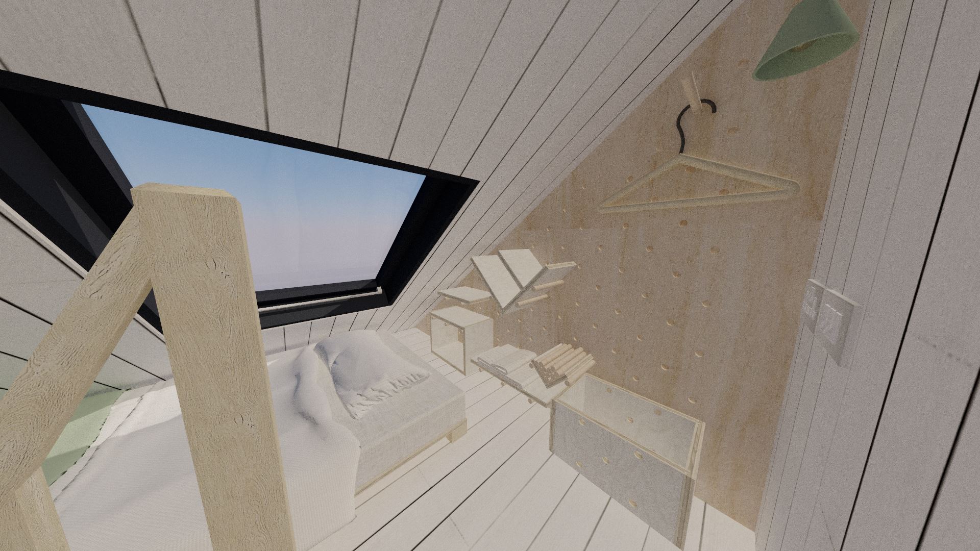
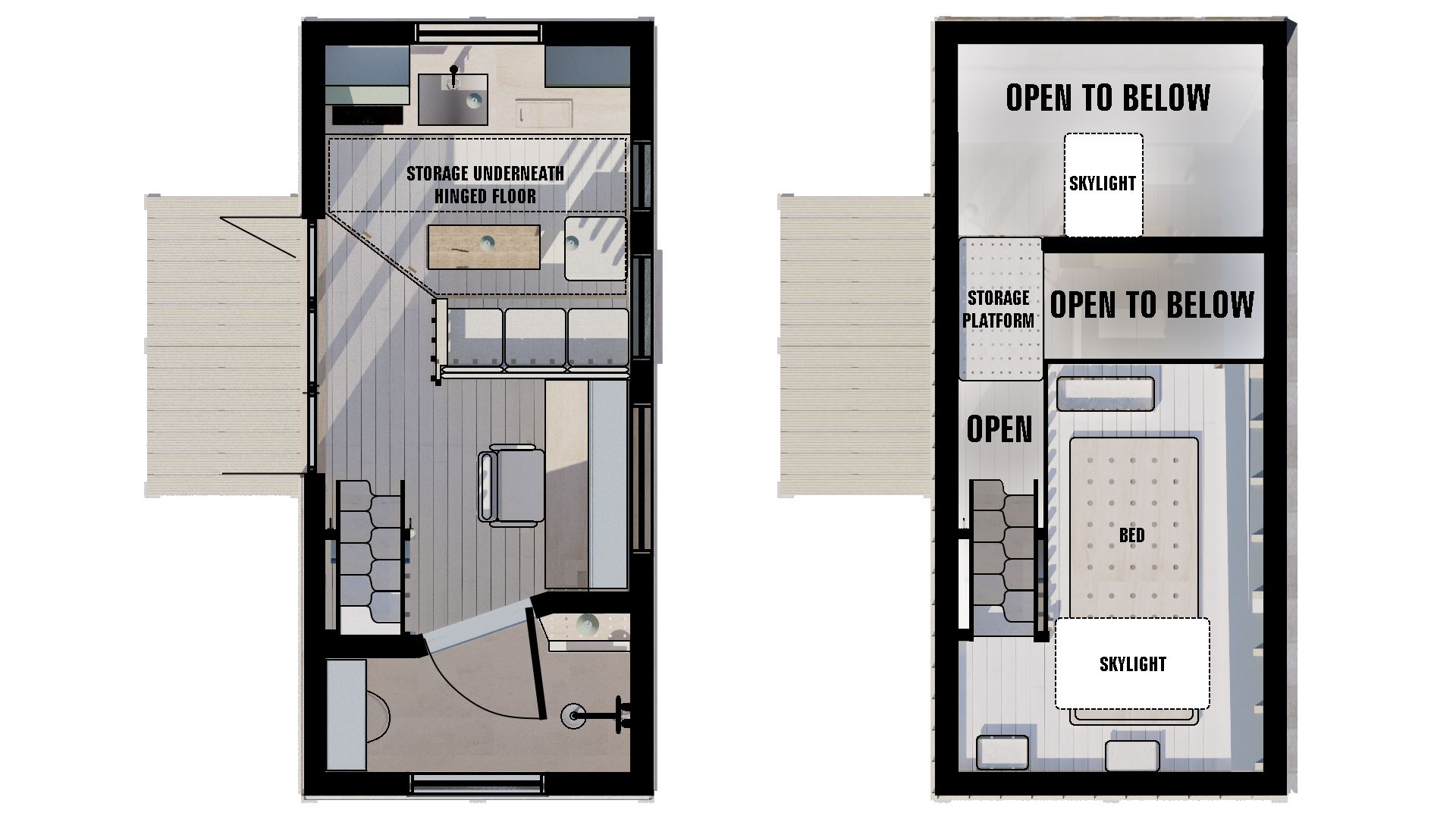
Meanwhile, on the upper floor (or rather just "the sleeping loft", since it can barely be called a floor!), things are kept as simple as possible. In order to minimise the vertical impact of the house as much as possible, only one corner reaches maximum height; this is above the stairs, so that getting into the sleeping loft is not too much of a nightmare. The only problem as you'd imagine is probably getting out of bed; so this will be something I'll be looking to address on the next iteration! Despite my current living/working arrangement at home meaning that I have to spend pretty much all day in my bedroom, I would actually much prefer to use it purely for sleeping. It has been proven in numerous studies that working in your bedroom is not conducive to good sleep, nor productivity. That’s why you’ll often find bedrooms in my designs to be as small as possible; I find big bedrooms a waste of space, and would much rather have a large living area than a large bedroom and bathroom.

A SECTION VIEW:


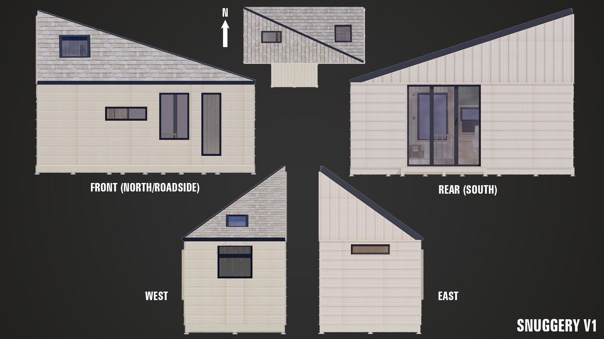
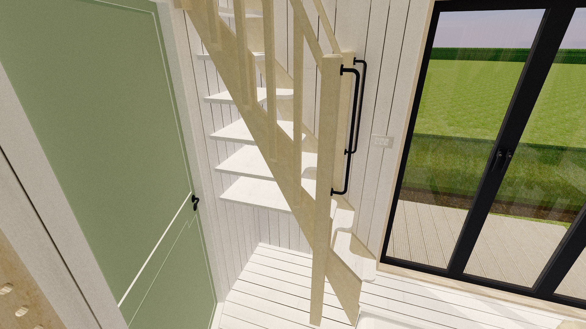
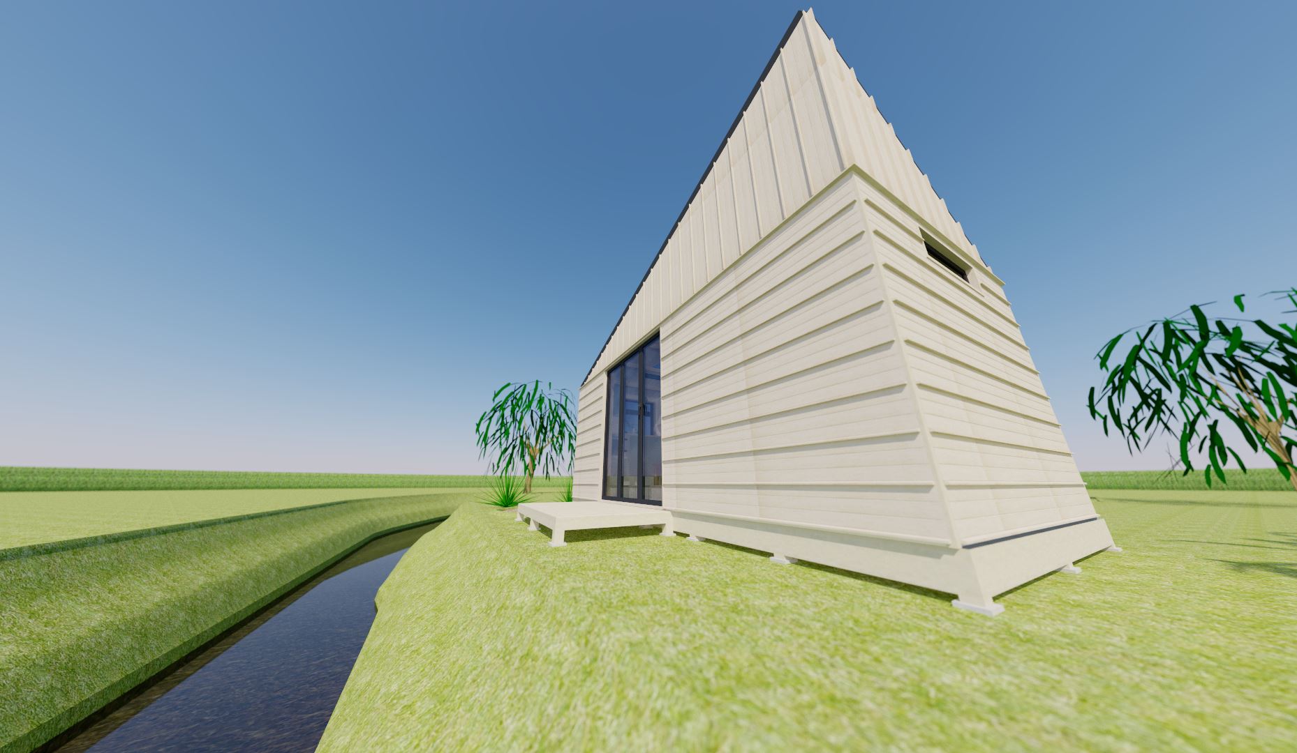
The brief gives us quite a lot to fit in a width less than 2.5m (especially once you account for the thickness of walls!). It took a lot of trial and error and shuffling around to find a layout that fits onto a standard 5.4m long trailer. As a direct result, there is quite a lot of custom furniture, and not everything could be designed to British Standards. For example, there is no getting past the fact that it would not be a suitable house for anyone with mobility problems! The staircase is not only very narrow, but also, being an alternate tread design, very steep.

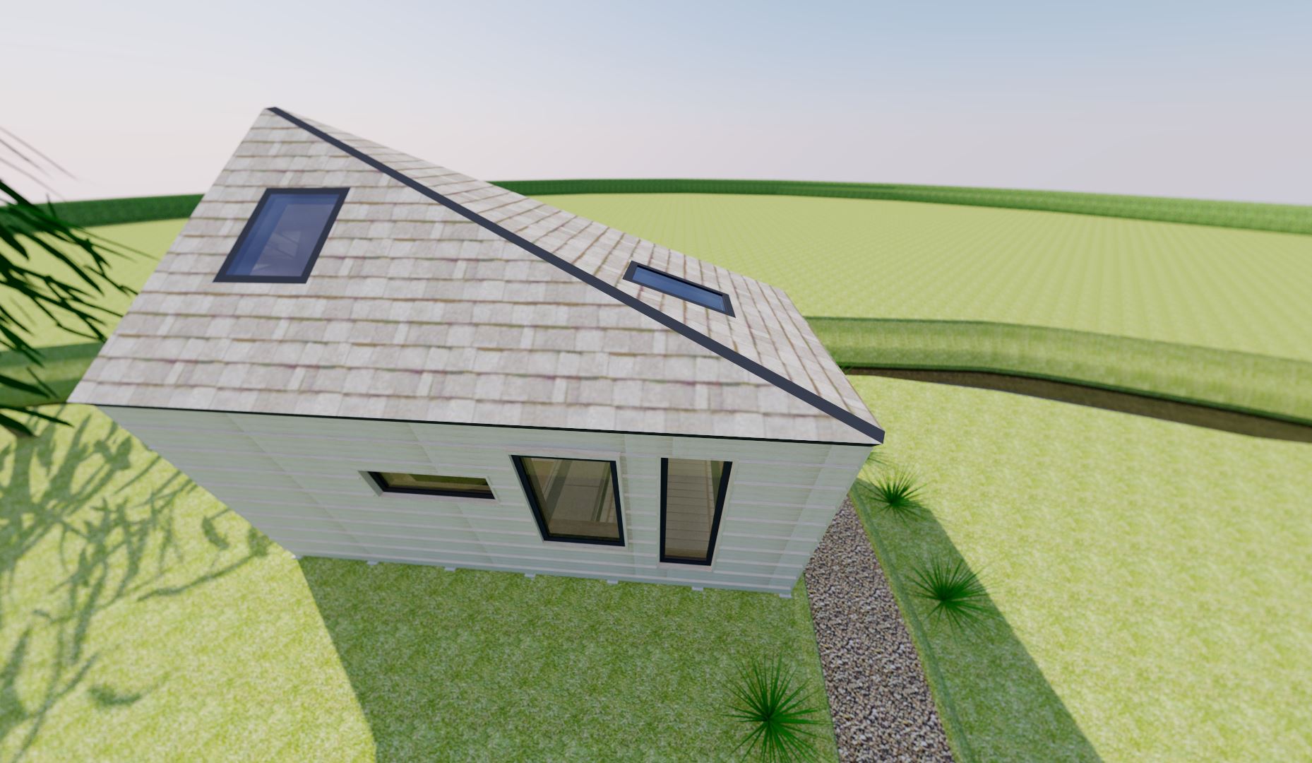
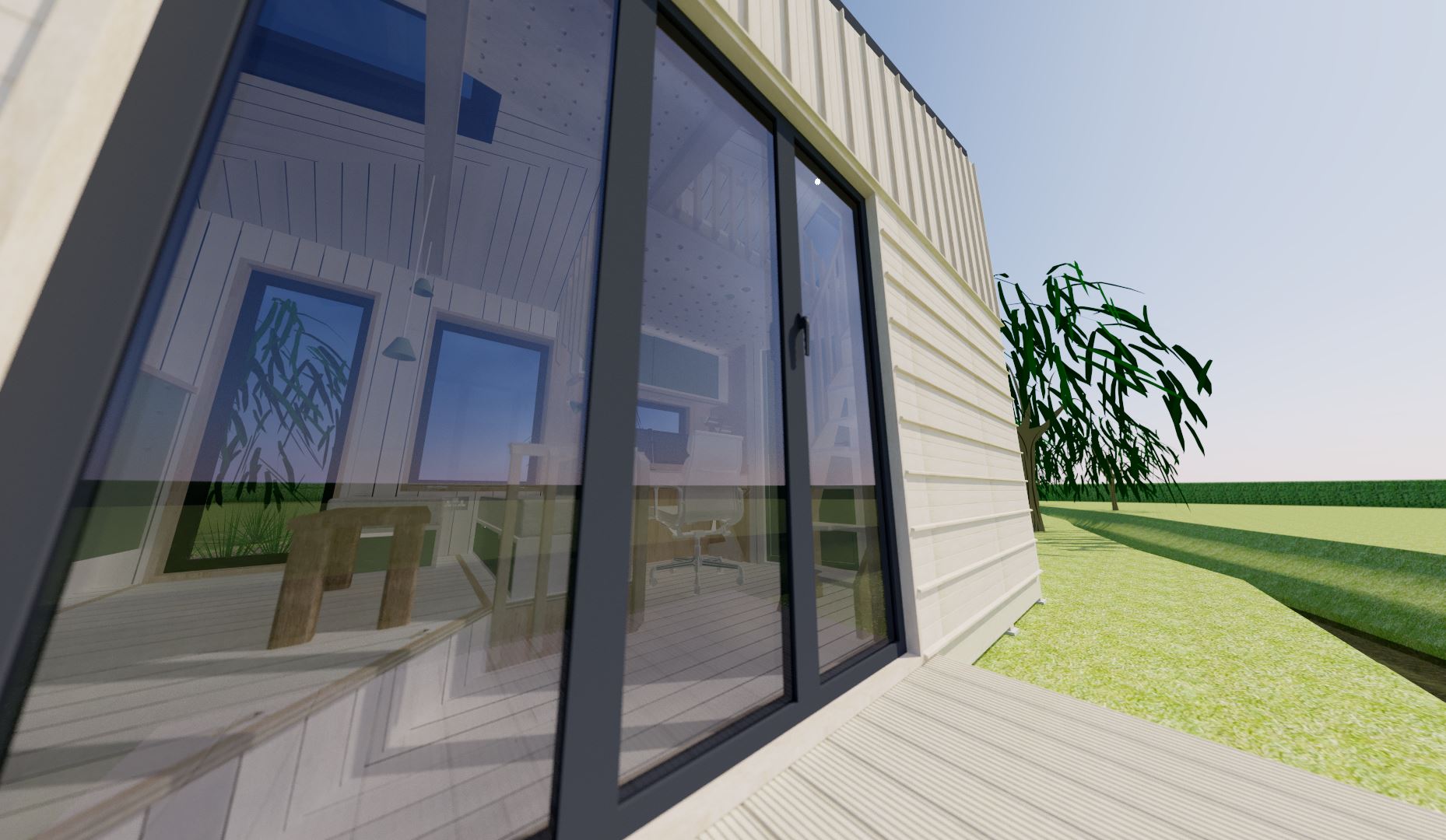
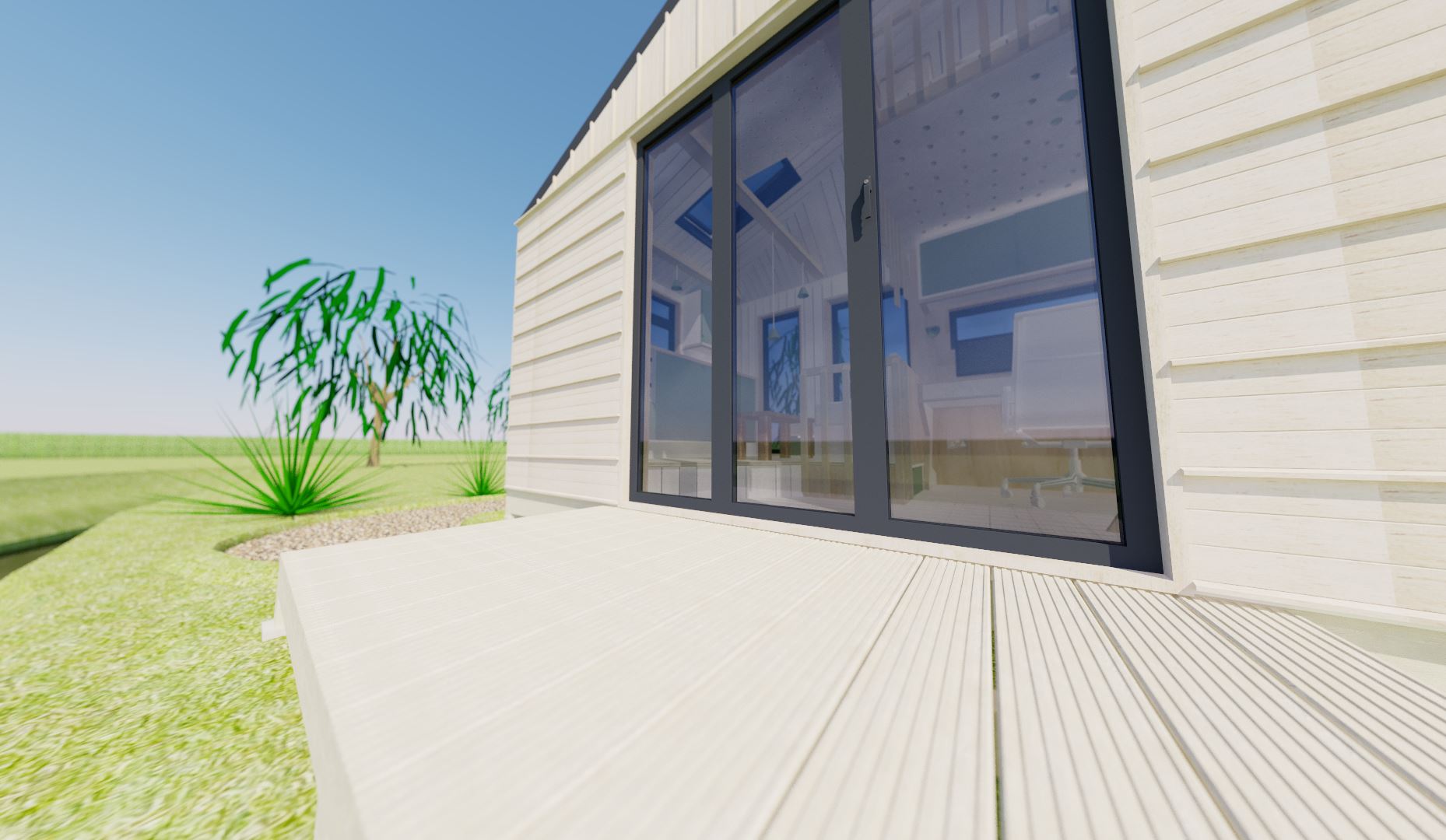
The dimensions of the building are no accident; they fit within the limits allowed on UK roads. The height is half a metre under the maximum, which should give enough spare for it to sit on a flatbed trailer and still fit under most modern bridges! Space may be tight, but there's still room for almost everything I need; the only exception being a washing machine.


A section view shows just how compact this design really is!
The elevations show the ideal orientation of the building. In reality, it can be turned 30 degrees either way and still make the most of the light.
THE EXTERIOR:
THE EXTERIOR:


As we've seen, the form itself is essentially a cuboid with one corner pulled up to a point. This not only reduces the visual impact of the structure, but will also help provide a little bit less air resistance; particularly if the property needs to be moved on a trailer! The sleeping loft is certainly not roomy; and a little extra height certainly wouldn't go amiss. It wouldn't be quite so elegant, but I can see a few alternative roof designs that would allow a bit of extra room in the sleeping loft.

Material-wise, the exterior is kept very simple with an oak or similar wide-boarded board and batten cladding. To keep things interesting, the upper "storey" has the board and batten cladding vertical instead. The roof is clad in large wooden shingles; although not actually common in the New Forest, the shingles offer a more natural appearance, and will weather nicely.

The front elevation (roadside) shows how effective the roof design is at minimising the overall impact of the building.
Even the rear view with the taller side isn't exactly imposing, even at a harsh low angle like this!
The decking may not be large, but it certainly would make for a nice place to sit in the summer evenings!
THE INTERIOR:
LOUNGE & KITCHENETTE:


The first thing you'll probably notice when you walk into the tiny house is that the kitchen/living area is raised up on a 220mm high platform. The reason for this is two-fold. Firstly, it creates a visible demarcation between the living area and the other areas, whilst still keeping it an open plan layout. Secondly, it produces tons of storage space under the floor; ideal for those items that are mostly seasonal in use. In fact, it's even long enough to fit in a single bed (although it would have to be a custom-shaped foam mattress).

The living area is basically just a custom made foam-covered bench with yet more storage underneath!

Like everything in this tiny house, the living area is snug!
Living on your own means a dishwasher certainly won't be needed; helping to make the kitchen nice and compact.
Despite the small space, there's enough room for a small coffee table, a sofa for three, as well as an ottoman.
The workspace features plenty of storage!
WORKSPACE:


The workspace of course features my custom desk; with my heavy MIDI keyboard safely hidden, yet easily accessible. I really wanted this area to have a clear style to set it apart from the living areas of the tiny house, so one of the walls and the ceiling has a pegboard type panel cladding. The pegboard to the right of the desk does double up as storage for small things; perhaps stationary or the like. Meanwhile, the white pegboard on the ceiling is lit from behind using LED strip and can lights!

Of course, there's also the large cupboard with sliding doors above the dual monitor set-up, which gives us ample room for paperwork and books. A short window gives a little natural light. Currently the area under the stairs is not used for much, but a few of the stair treads do extend all the way back to the dividing wall and double up as yet more storage!

The desk is a pretty large bit of furniture; especially for a tiny house, but it is absolutely critical to allow me to carry out my work!
I really like these simple wooden slats with their 45 degree ends that form a visual separation from the living to the working zones.
WETROOM:


I'll be the first to admit that the wetroom isn't exactly much bigger than a shower that you'd find in a changing room; but it still has plenty of space for toiletries and a shelf for towels above the mirror. In many ways, it would be easy to clean this room, although I do plan on making some modifications on the next design that would prevent the whole wetroom getting, well... wet when taking a shower! That said, it's still a functional space, and the small window near the ceiling will help to alleviate any moisture issues (and you could of course fit an extractor fan, too).

The wetroom is obviously compact, but it still features all the amenities you'd need; including storage and a wash basin.
THE SLEEPING LOFT:

It's fair to say that those who suffer from claustrophobia may wish to look away now! In all seriousness, there are only two things that bother me about the loft; first is how awkward it would be to get out of bed, and the second is the difficulty of changing the bed sheets! A couple feet of extra width would've been extremely beneficial here.

There are some good points though; the wall opposite the alternate tread stairs is a neat little place to store clothes. Personally, I wouldn't need much hanging space, but for those that do, it wouldn't be difficult to add a wardrobe under the stairs. As you can see, I've gone for the pegboard style of storage. I love this because it gives you a lot of flexibility, yet is incredibly simple and easy to build.

The eagle-eyed among you will have spotted another perforated panel above the stairs. This is yet more storage; this time for boxes or other bulky objects. I suppose a ladder would've been useful on the wall to the left; another thing to refine for the next design!

Yes, the sleeping loft is about as small as I could make it; but there's still room for clothes storage.
A second view shows the storage wall better. Note also the wall-mounted lamp and light switches/sockets close by.
STORAGE:
IN PLAIN SIGHT:


A tiny house needs all the storage it can get, and whilst some such areas have already been talked about a little bit, but they're worth talking about in more detail. The first of which is in the living area, or more specifically, under the seats. This custom built bench-like sofa comprises of under-seat storage compartments. With a few basic power tools, and some marine ply and softwood battens, it wouldn't take more than a long weekend to knock up the sofa; and there are plenty of upholstery shops that can cut foam to size and cover it in your chosen fabric. It probably won't be as comfy as a traditional sofa for longer sits, but I spend most of my time sat at my computer so for me it's not a huge concern. Oh, and even the ottoman has built in storage made in exactly the same way.

Elsewhere, the workspace and the wetroom both have simple cupboards with sliding doors; all made with more marine ply. The doors may sound complex to make, but routing out the top and bottom of the unit with a router will provide trenches for the doors to sit in; they can then be "greased" with graphite to keep the doors sliding smoothly. There are also the shelves under the stairs (well, formed by the stair treads themselves).

The storage under the ottoman and sofa provides a ton of space for books, magazines, placemats, or whatever else may be needed close to hand.
Even the steep stairs form their own shelving space! I'd probably use the shelves for clothes and towels, and the space at the bottom for shoes and boots.
And of course the sliding doors of the workspace and wetroom cupboards provide ample room for important documents and toiletries respectively.
HIDDEN:


There are also some hidden storage areas that would easily be missed. The first we've briefly discussed before; under the living area floor. Given that you'd have to move the ottoman and coffee table (as well as needing to stand by the door to access it), it's only really meant for seasonal items; things like coats, blankets etc. It's actually big enough to fit a single bed in (if you can get a custom foam mattress cut to form the angle near the step); although that would obviously mean you'd not be able to access the kitchen during the night if someone was sleeping there. Looking at it in retrospect, you'll likely need some sort of bracing underneath the ply top to support the weight of at least 3 people when in the closed position.

Hidden away by the work area, there's actually a second hidden compartment; this time under the sofa, and accessed from my desk. You could use this to store whatever you like really as it would remain accessible, even if using the desk. Taking things a step further, whilst the desk blocks the other half of the void under the sofa, you could feasibly pull the drawer all the way out to access that side, too!

The large hidden storage area folds into two, and rests against the kitchen units.
The hidden drawer by the workspace is easy to miss!
The wetroom is fully kitted out with a large shower head, although I hope you're not too tall as the ceiling is barely over 2m.
A close up of the exterior shows the board and batten cladding, along with horizontal rain strips.
The large 3-leaf bi-fold door not only lets in a ton of natural light, but it also helps make the space inside larger.
An alternate view of the bi-fold door shows that this also acts as the only entrance, which steps leading down from the low decking.
The simple exterior not only looks fairly modern, but the choice of oak cladding will also help reduce its visual impact; especially once the oak weathers.
Walking in through the bi-fold doors, the effectiveness of raising the living area is shown to good effect. Note the socket between the handrail posts, and the skylight above.
Looking over to the compact working area gives us a better look at the alternate tread stairs. Note how some of them reach all the way back to the wetroom wall for added shelving!
Sitting on the sofa, you can get an idea of how just how light and airy this space feels thanks to the bi-fold doors and plethora of windows. Note the hanging lights.
An alternate view of the workspace shows that it too gets plenty of natural light. Open plan tiny houses are really important to maximise on the space and available light.
With both the living and working areas in full view, it really goes to show just how compact this space is. Note the panel on the floor of the living area that lifts up to provide seasonal storage.
FINAL THOUGHTS:

Overall, I feel like I couldn’t have made the design any smaller and still had space for everything I wanted. The THOW design I came up with last year was an example of (I think, at least) the smallest possible tiny house that still fits in everything you could need to live full-time; however, there was no room for my music desk which is absolutely crucial if I am to work at home. I did consider that, if I manage to get a small plot of land (say 50 square metres or even less), there would be a possibility to build a small self-contained office pod; thereby separating work from play, and thus being able to be more efficient with the tiny house layout. As such, that will form the basis of the next design!

We've talked a lot about a few obvious things that could either improve quality of life, or otherwise enhance the building. The loft being perhaps the biggest ; it wouldn't take a lot more space for it to be more usable, and by the time I move the working area out of the tiny house, it should open up more layout possibilities! Other perhaps subtler changes include a sofa with a higher back (it's pretty low at the moment, so may be uncomfortable for long periods of sitting). There's also no TV, although as I designed this space purely with myself in mind, that would not bother me in the slightest as I don't watch it!

Overall, despite the many things I would change, I think it's been a very useful exercise in finding out what I can get away with in such a small space. Now it's over to you; what would you change? Is the living area too small for you? I'd love to hear your thoughts, good or bad!

'Till next time,

Jam

A final view of the inside, looking back towards the kitchenette and living area. The neutral colours and earthy tones help make the space feel bigger.
Please feel free to Tweet me @StudioJamming, or email me. As always, you can find contact and social buttons at the bottom of your screen!